Appearance
This page allows you to customize the Apinizer API Portal interface to match your corporate identity. The portal's overall design, color scheme, font, page headers, and content areas are managed through this screen. It also allows for the creation of multilingual content for the home page, information (“How It Works”) and footer areas. Changes made can be previewed in real time on the portal interface and are implemented to provide the user with a corporate, holistic experience.
Contents
Basic Settings
The Theme and Appearance settings on the Apinizer API Portal are managed from this screen. Visual identity, color palette, font, and page titles are customized from this screen.
The image below shows the external appearance screen details:
Figure 1:

Impact on the API Portal Interface
The following images show the Theme and Appearance settings screen of the Apinizer API Portal. The numbers on the image indicate the locations of the configurable fields:
Figure 2:
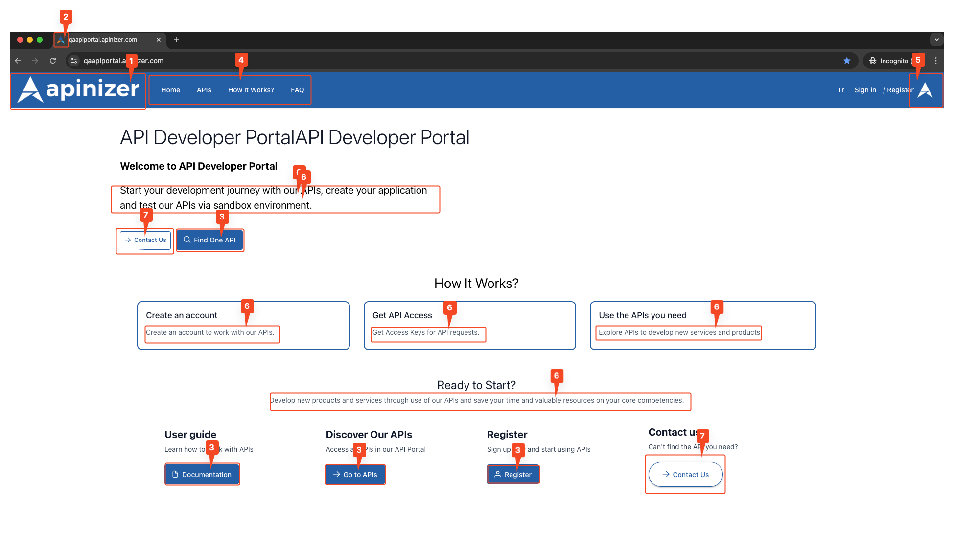
Figure 3:
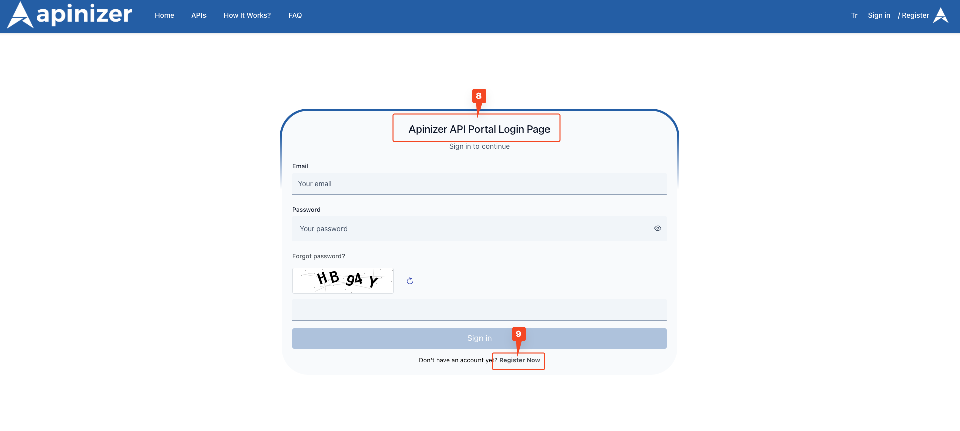
Figure 4:
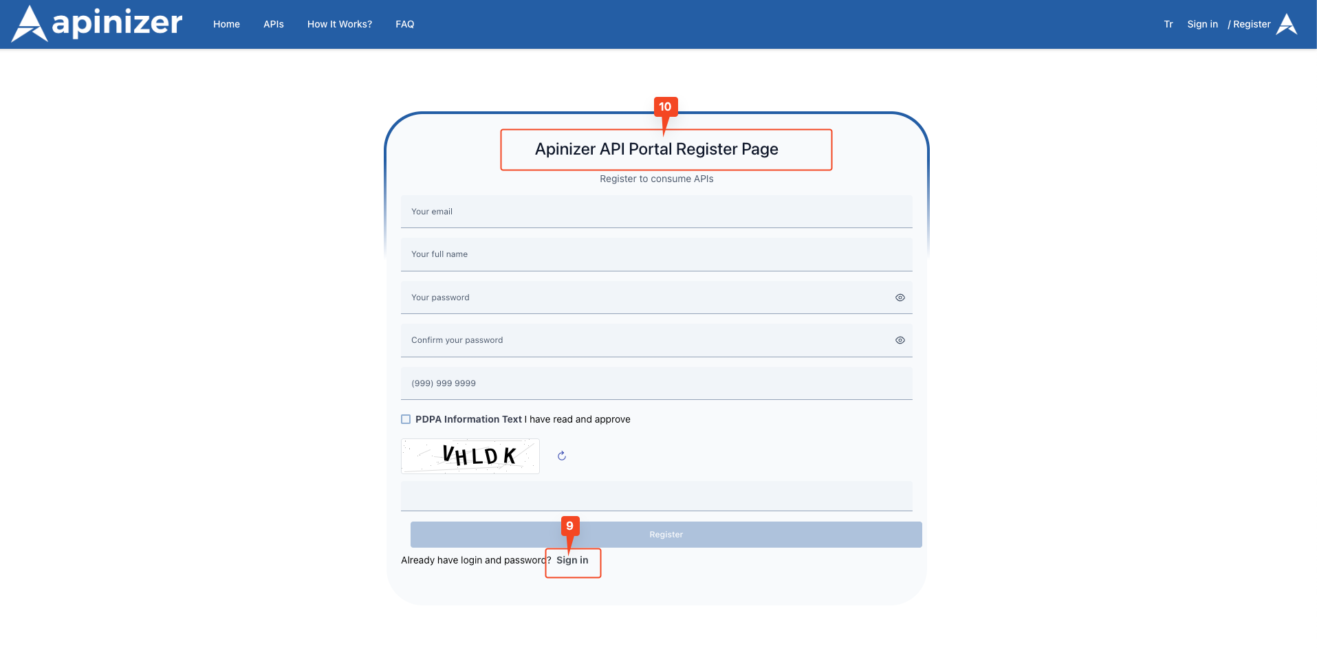
Figure 5:
The fields used for the theme view screen configuration are shown in the table below.
Field | Description | Technical Details | Appearance |
|---|---|---|---|
Primary Logo | The logo to be displayed in the header component of the API Portal is added here. The official images of all logos used in the application are obtained from here. Users typically click on this logo to return to the home page. It represents the main logo visible in the top left corner of the portal's top menu bar. | Maximum file size: 5MB Supported formats: .ico, .svg, PNG, JPG, JPEG Recommended size: Maximum 200px width x 50px height | 2. It corresponds to the area marked with number 1 in the image. |
Favicon | The favicon that you want to appear in the browser tab and throughout the application is added here. The small icon that appears in the browser tab. | Maximum file size: 5MB Supported formats: .ico, .svg, PNG Recommended size: 32x32 pixels or 16x16 pixels | 2. It corresponds to the area marked with number 2 in the image. |
Primary Color | This is the field where the “Primary Color” information is entered in the API Portal. It is the primary color for the blue-toned buttons (e.g., “Find One API,” “Register”) and highlights on the page. It is the background color for active menu items. It is used to align the user experience with brand colors. | Hex color code format (e.g., #245EA5) Can be selected visually with the color picker Hex code can be entered manually | 2. It corresponds to the area marked with number 3 in the image. |
Menu Link Color | This is the field where you enter the “Menu Link Color” display information in the API Portal. It determines the text color of menu links such as “Home,” “APIs,” and “How It Works?” located immediately to the right of the logo. | Hex color code format (e.g., #ffffff) Colors that contrast with the background color should be selected. | 2. It corresponds to the area marked with number 4 in the image. |
Logo Right | This area is used to add a second logo to the right of the main logo at the top of the portal. Typically, the institution's partner logo, project collaboration emblem, or sub-brand logos are displayed in this area. It displays a second logo (e.g., partner or project logo) to the right of the main logo. | Maximum file size: 5MB Supported formats: .ico, .svg, PNG, JPG, JPEG Recommended size: Maximum 150px width x 50px height | 2. It corresponds to the area marked with number 5 in the image. |
Text Font | This is the field where the “Font” information is entered in the API Portal. It is used in all text content on the Portal. A font consistent with the corporate identity is used. | Standard web fonts can be used (Arial, Helvetica, Times New Roman, etc.) Google Fonts can be used (Roboto, Open Sans, Lato, etc.) Enter the font family name (e.g., “Roboto, sans-serif”) | 2. It corresponds to the area marked with number 6 in the image. |
Login Page Title | This is the field where the header information for the “Login” page on the API Portal is entered. You can configure separate settings for the page displayed in English and Turkish. The page title for the “Login” screen (example: “Apinizer API Portal Login Page”). | A maximum of 255 characters can be entered. | 3. It corresponds to the area marked with number 8 in the image. |
Register Page Title | This is the field where the title information for the “Sign Up” page on the API Portal is entered. You can configure separate settings for the page displayed in English and Turkish. The page title for the “Register” screen (example: “Apinizer API Portal Register Page”). | A maximum of 255 characters can be entered. | 4. It corresponds to the area marked with the number 10 in the image. |
Component Link Color | The “Link Color” information in the API Portal is used to determine the color of all links except menu links. It changes the color of links outside the menu. It determines the color of links within cards. It determines the color of clickable items in list items. | The hex color code format is used. It should provide contrast with the background for readability. | It corresponds to the area marked with number 9 in Figures 3 and 4. |
Contact Us | This is the field where you enter the URL to which the “Contact Us” button on the API Portal should redirect. It determines the address to which the “Contact Us” button will redirect. | A maximum of 500 characters can be entered. An email address or contact URL can be entered. | 2. It corresponds to the area marked with the number 7 in the image. |
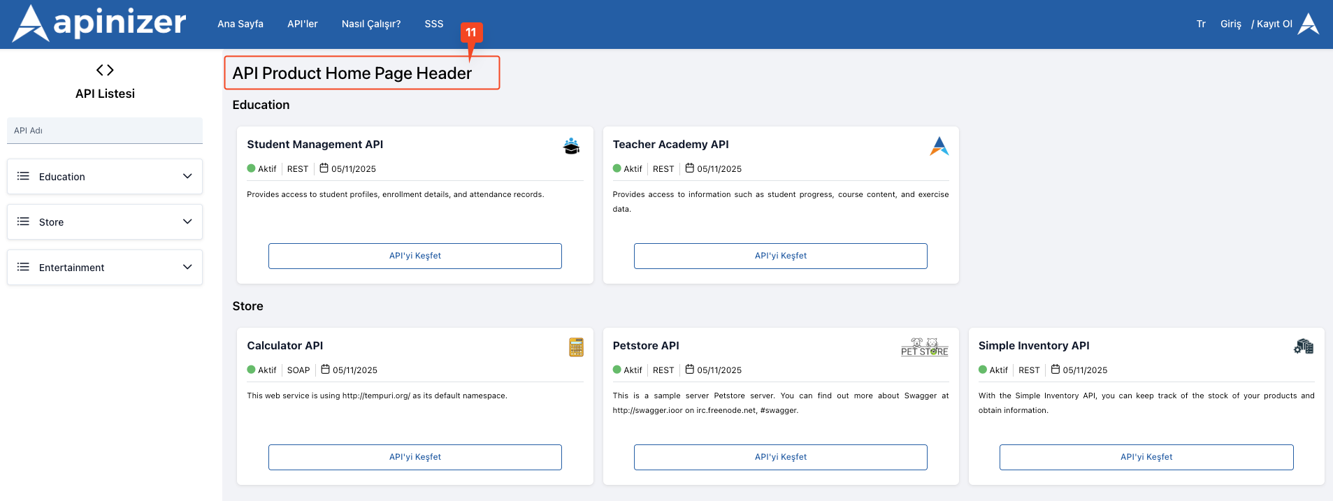
API Product Home Page Header | It is the title of the API Product Home Page on the API Portal. It changes the title “Discover Our APIs”. | A maximum of 500 characters can be entered. | 5. It corresponds to the area marked with number 11 in the image. |
API Product Home Page Header (TR) | This is the Turkish title of the API Product Home Page on the API Portal. | A maximum of 500 characters can be entered. | 5. It corresponds to the area marked with number 11 in the image. |
Home Page Settings
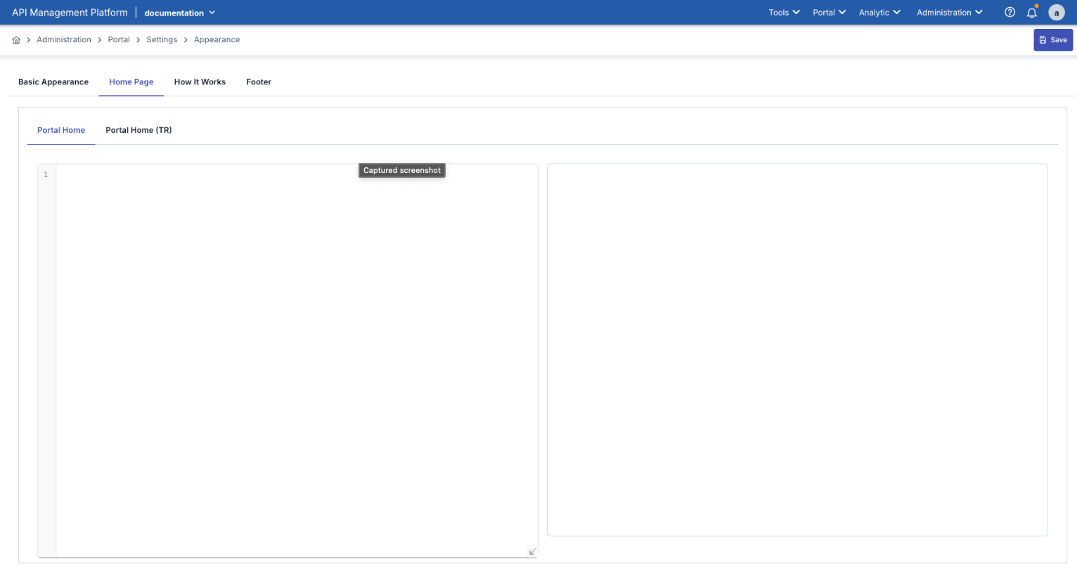
This area is the section where the content users first encounter on the API Portal homepage is organized. The portal's introductory texts, explanatory descriptions, links, or visual content are defined in this tab.
During editing, a “Preview” section appears on the right side; this allows you to instantly see how the changes will appear on the portal.
The left side contains the content editing area, where HTML or plain text can be added.
A welcome message, description, or guide text consistent with the portal's corporate identity can be created in this area.
The Home Page offers support for two languages:
Portal Home (EN): English content area
Portal Home (TR): Turkish content area
If both language options are active in the Portal Settings screen, the system automatically displays the content in the appropriate language to the user.
The image below shows the screen details for the Home Page content:
Impact on the API Portal Interface
By default, the home page appears as shown in the attached image:
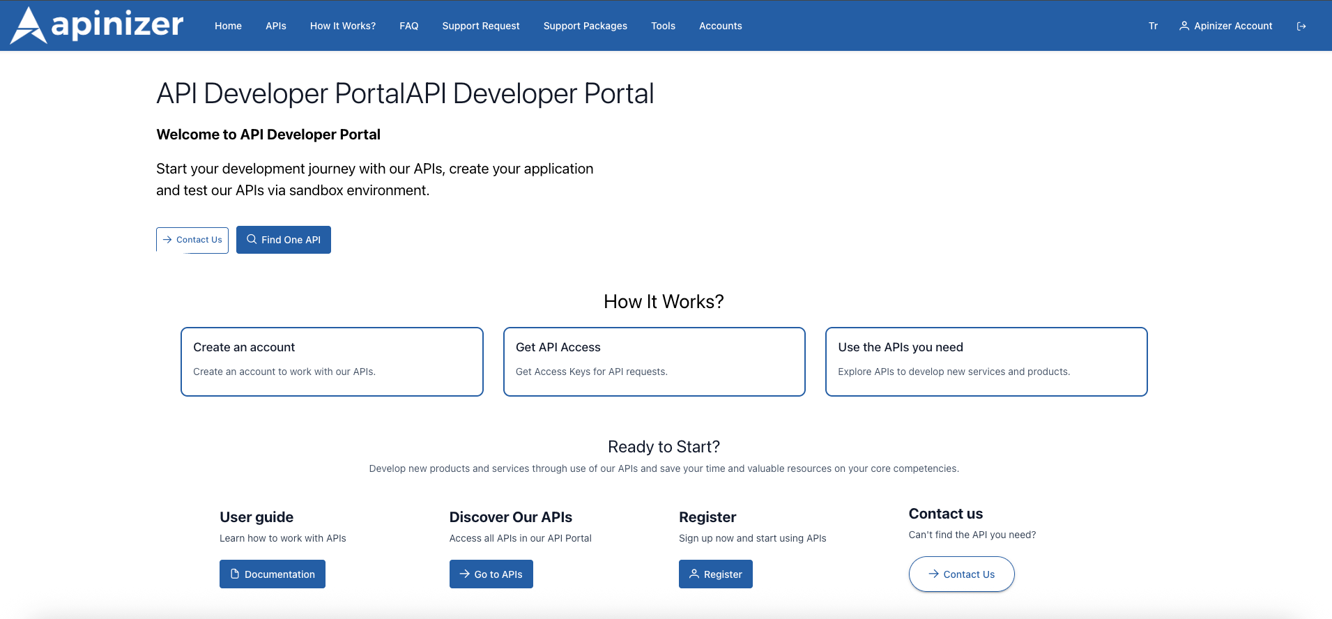
When default content is entered, the portal homepage opens with a welcome header, a short description, and action cards such as “How It Works?”, “Discover Our APIs”, ‘Register’, and “Contact Us”. The attached screenshot (example) shows how the homepage cards are aligned.
After saving your own HTML, you can see the same area live when you refresh the portal page. If you used a column structure in the HTML, the cards or banners will appear in that area.
How It Works
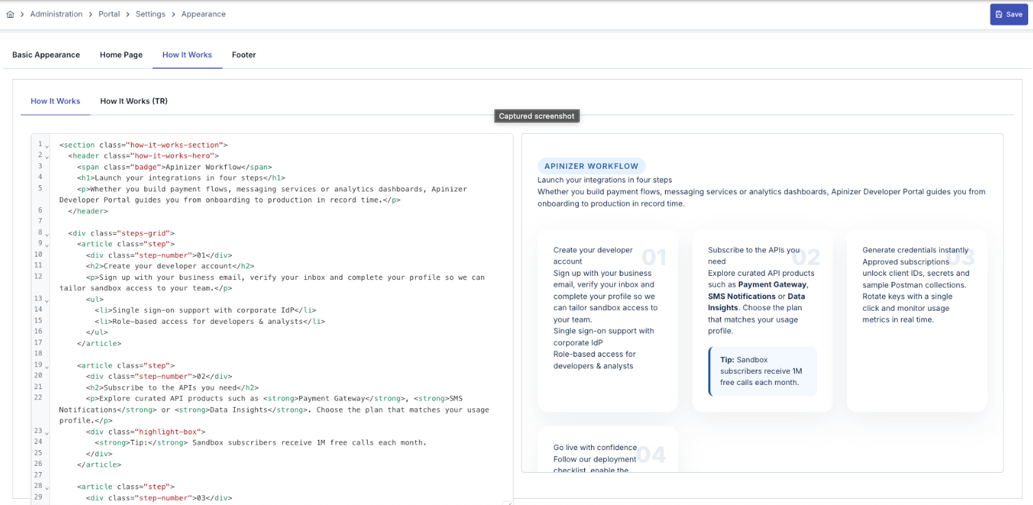
This area is used to manage the content of the “How It Works” page on the API Portal. It is the section where portal users are provided with informative content such as the general operation of the system, the API access process, or a step-by-step usage guide.
On the left side is the content editing area, and on the right side is the “Preview” area, which shows how the changes will appear on the portal.
Content can be prepared in HTML format; rich text elements such as headings, lists, or links are supported.
How It Works offers two language options:
How It Works (EN): English content area
How It Works (TR): Turkish content area
When both language options are active in the Portal Settings section, the user is automatically shown the “How It Works” page in the relevant language.
This page is usually prepared to enhance the user experience and explain the use of the portal.
An example of How It Works content is shown in the image below, which includes screen details:
Impact on the API Portal Interface
The visual containing the API Portal view of the sample screen is provided below:
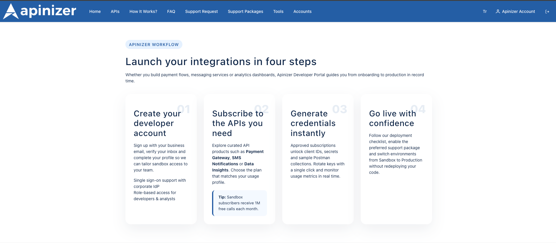
How It Works The HTML field uses the same HTML editor. If you support multiple languages, fill in both tabs. You can add step-by-step guides, icons, and numbered lists to the content.
Menu path: Portal top menu → How It Works?
The content is rendered as HTML, and “Home / How It Works?” appears in the breadcrumb.
Language control: Currently, the component uses English content (howItWorksHtml); if you want to add TR support, you need to extend the component.
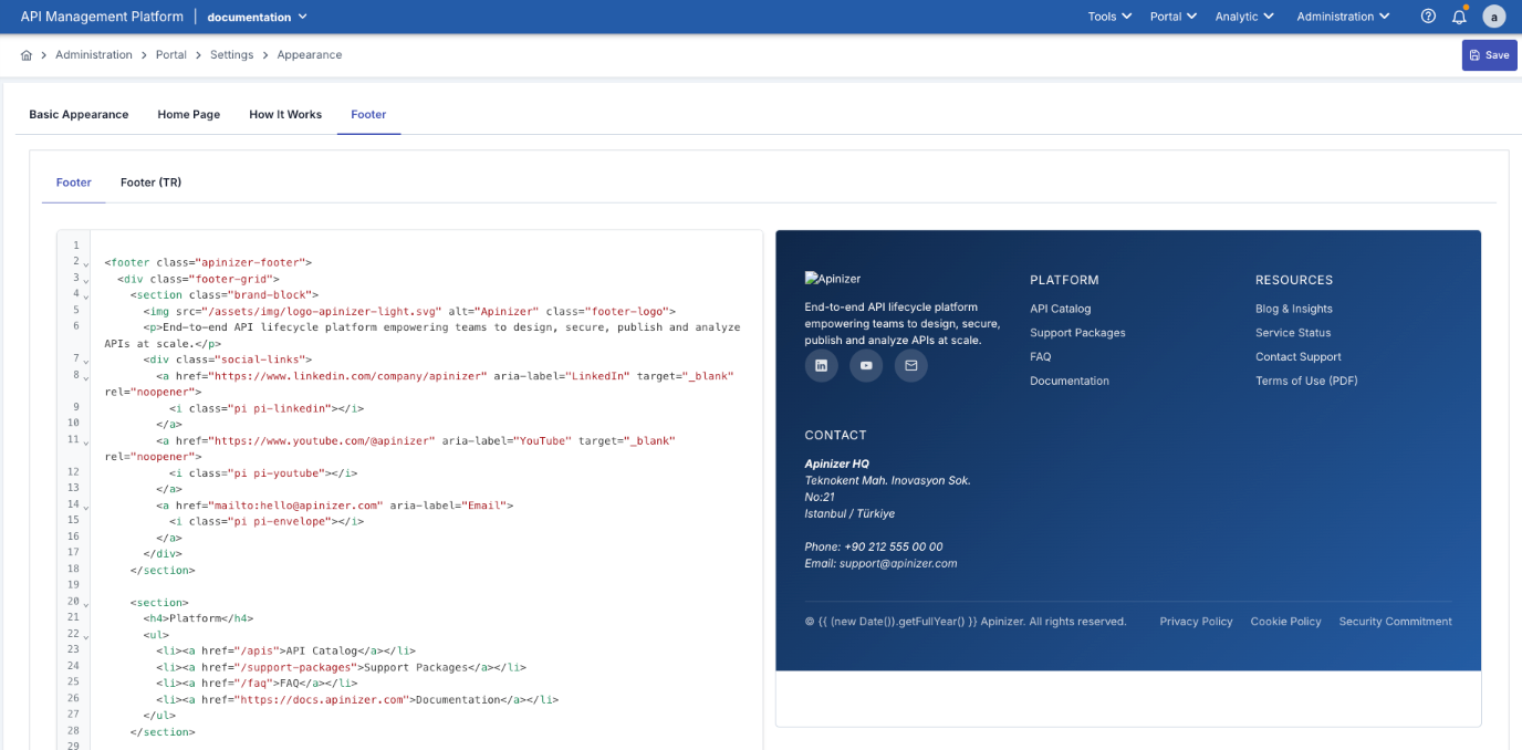
Footer Settings
This section is where you can edit the content that will be displayed at the bottom (footer) of the API Portal. Typically, this includes contact information, legal text, copyright statements, or corporate links.
You can add HTML or plain text to the text field on the left; this allows links, logos, or short informational texts to be displayed in a formatted manner.
The “Preview” field on the right instantly shows how the changes will appear at the bottom of the portal.
The Footer supports two languages:
Footer (EN): English content area
Footer (TR): Turkish content area
If both TR and EN languages are active in the Portal Settings screen, the footer area in the user's preferred language is automatically displayed.
This allows the bottom section of the portal to be organized in a multilingual, corporate-appropriate manner.
An example of footer content is shown in the image below, which includes screen details:
Impact on the API Portal Interface
A visual representation of the sample screen as it appears in the API Portal is provided below:
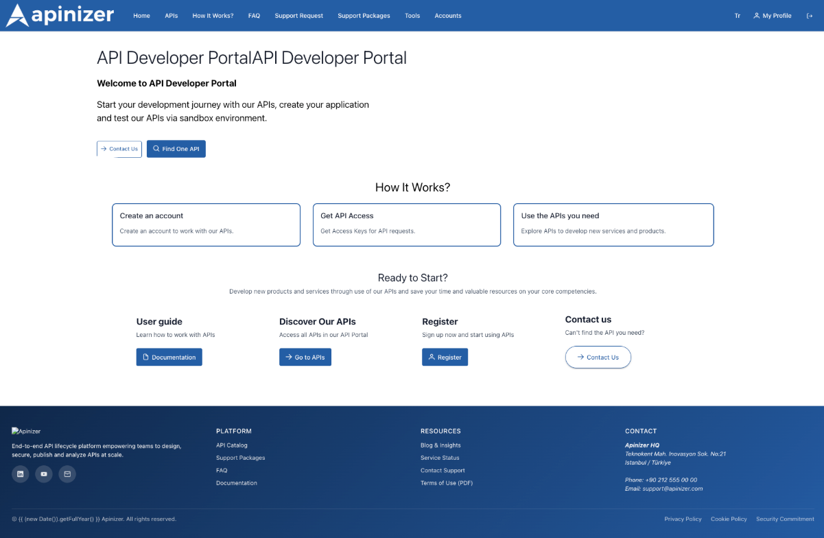
The footer HTML area is the HTML visible in the portal footer section.
You can add social media icons, contact information, and legal text.
If embeds containing scripts (e.g., live chat) are required, you can use <script> within the HTML; the component is designed to execute these scripts.
How it works:
- HTML content is made secure with DomSanitizer.
- If there is <script> in the content, it runs the executeScripts() function and adds the scripts to the DOM.
- When the setting changes, the footer is updated immediately (refreshing the page is sufficient).
Save and Preview
Saving Process
How to Save:
- Click the “Save” button in the upper right corner.
- All tabs (Basic, Home Page, How It Works, Footer) are saved simultaneously.
- After successful saving, changes are immediately reflected on the portal.
Preview:
- Real-time preview is available in the Home Page, How It Works, and Footer tabs.
- While writing code on the left, you can see how it will appear live on the right.
- JavaScript code also works in the preview (thanks to the apimRunScripts directive).
Basic Fields
| Field | Description | Location in Portal |
|---|---|---|
| Portal Home HTML | HTML content to be displayed on the homepage | Catalog entry screen |
| Portal Home HTML (TR) | Turkish version of the same content when Turkish language is active | Homepage when the language is Turkish |
| How It Works HTML | HTML content for the “How It Works” page | entities/how-it-works/how-it-works.component |
| How It Works HTML (TR) | Türkçe version | “How It Works” page when the language is Turkish |
| Footer HTML | Footer area of the portal | layout/footer/footer.component |
| Footer HTML (TR) | Turkish version of the footer | Footer when the language is Turkish |
| Logo / Logo Right / Favicon | Visuals used in the portal's top bar | navbar and index.html |
| Primary Color | Main theme color (e.g., plan cards, buttons) | Throughout the portal |
Common Problems:
Question | Answer |
|---|---|
Why Are Changes Not Appearing on the Portal? |
|
Why is the Favicon Not Updating? |
|
Why is the HTML Preview Not Working? |
|
Why Are the Colors Different Than Expected? |
|
Why Are Multi-Language Contents Not Showing? |
|