Visualizing API Traffic Logs with Kibana
Kibana is an interface program used to visualize and analyze Elasticsearch data. Kibana retrieves data by communicating with the Elasticsearch cluster. When the Kibana server is lost, all data is safely stored in the Elasticsearch cluster. Kibana enables users to visualize Elasticsearch data with graphs and visual analyses.
One of Kibana's core features is the ability to monitor logs recorded in Elasticsearch in real time. This allows you to track and analyze log data in real time.
Kibana is a powerful tool for users to understand, analyze, and share data. With the creation of visual analyses and reports, users can interpret and share data more effectively.
Kibana Installation (Windows)
You can choose Kibana's Basic version or Free version. While the Basic version usually comes with paid subscriptions, the Free version is an open-source alternative. This document will use the free version.
For a compatible Kibana version, you can visit https://www.elastic.co/downloads/past-releases/kibana-oss-7-9-2. Free version.
- First, after selecting the version suitable for your operating system from the link pages above, simply click the relevant link to start the download. Once the download is complete, you can proceed with Kibana installation.
- Extract the downloaded file and save it to the target folder.
- Enter the Kibana file and copy the file path by entering the bin folder.
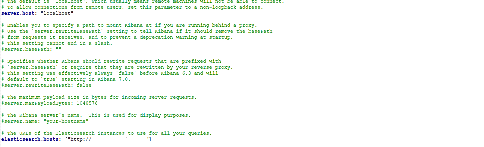
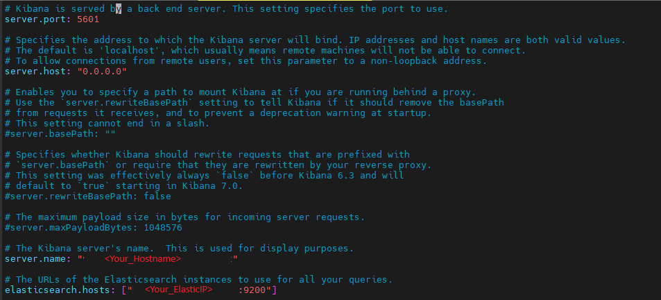
Edit the server information for Apinizer's Elasticsearch Integration in the "kibana.yml" file in the Config folder for configuration as follows.
- Open Command Prompt as administrator and navigate to the copied kibana file with the cd command.
cd C:\kibana-7.9.2
- Run the following command with the .bat extension to start Kibana.
- Kibana will start after a few seconds.
bin/kibana.bat
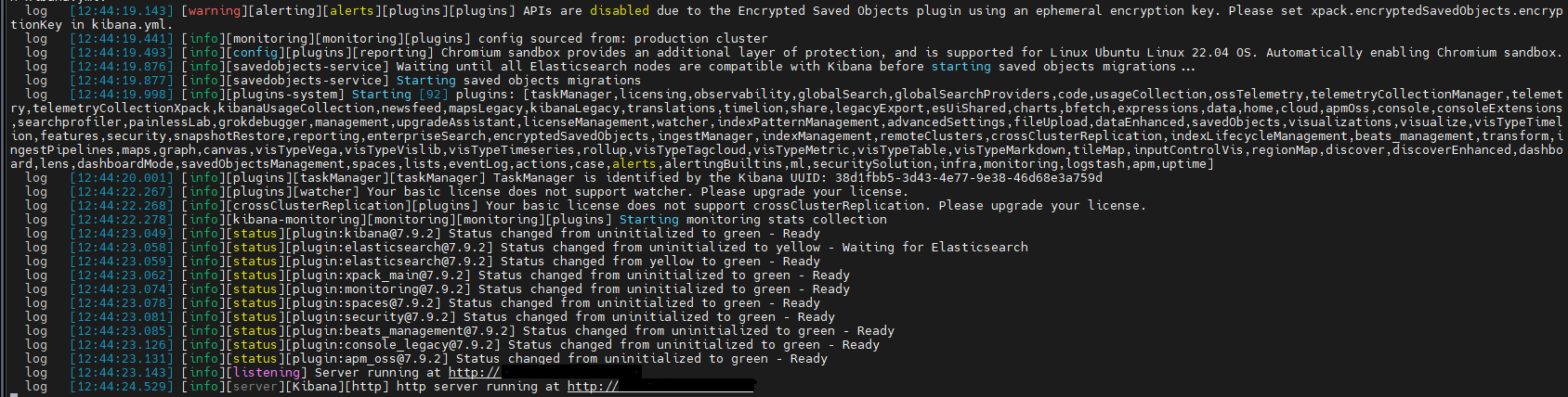
- If everything is fine, you will see a result like this.
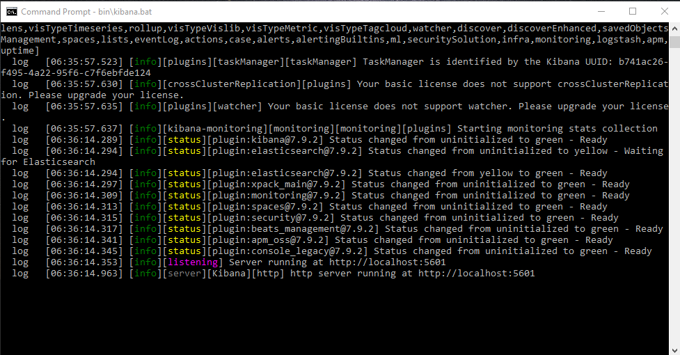
- The running Kibana uses port 5601 by default.
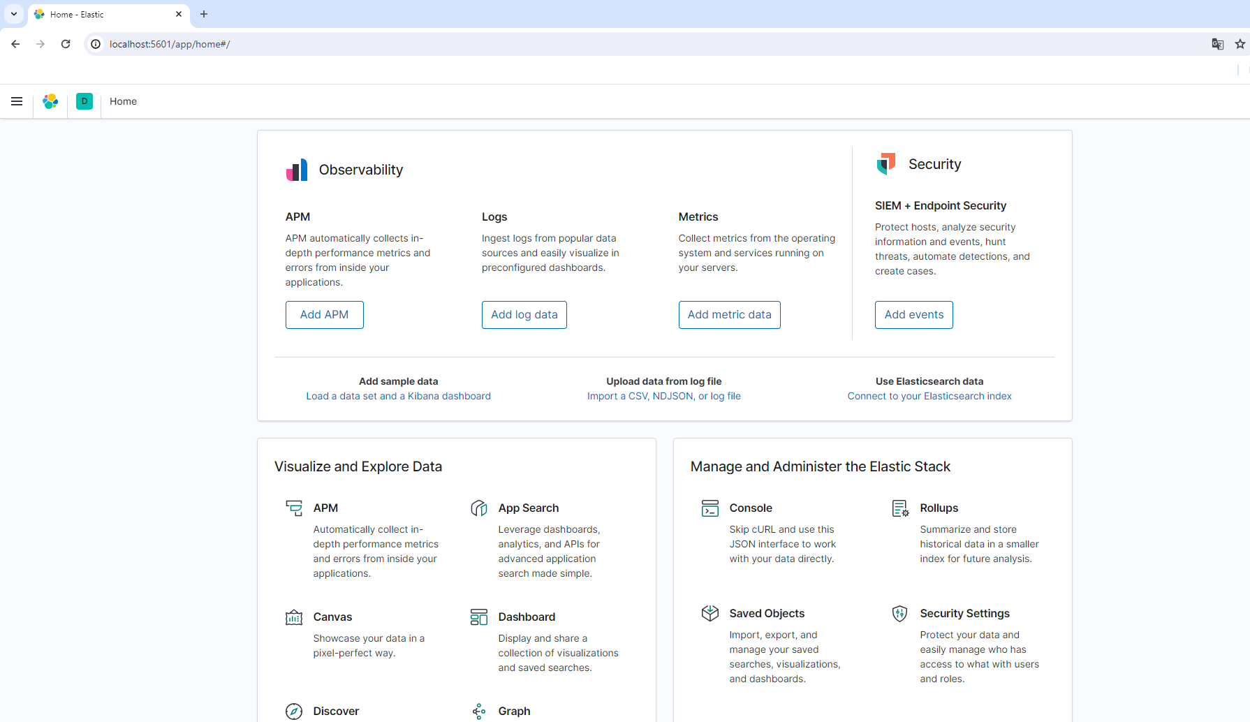
- To check if Kibana is running, you can check by typing "localhost:5601" in your browser.
- When we log in, we see the Kibana interface connected to Elasticsearch.
Kibana Installation (Linux)
Kibana v7.9.2 Linux archive can be downloaded and installed as follows:
Download Kibana version 7.9.2 using the curl command.
curl -O https://artifacts.elastic.co/downloads/kibana/kibana-oss-7.9.2-linux-x86_64.tar.gz
Extract the Kibana archive file with the tar command.
tar -xzf kibana-oss-7.9.2-linux-x86_64.tar.gz
Navigate to the directory where Kibana was extracted (kibana-7.9.2-linux-x86_64/).
cd kibana-oss-7.9.2-linux-x86_64/
Edit the server information for Apinizer's Elasticsearch Integration in the "kibana.yml" file in the Config folder for configuration.
vi config/kibana.yml
Used to start your Kibana server.
./bin/kibana
If everything is fine, you will see a result like this.
Setting Up Kibana as a Linux Service
sudo chown -Rf elasticsearch:elasticsearch /opt/kibana-7.9.2-linux-x86_64
sudo vi /etc/systemd/system/kibana.service
[Unit]
Description=Kibana
After=network.target
After=syslog.target

[Install]
WantedBy=multi-user.target

[Service]
Type=simple
ExecStart=/opt/kibana-7.9.2-linux-x86_64/bin/kibana serve
WorkingDirectory=/opt/kibana-7.9.2-linux-x86_64
Restart=always
RestartSec=5
StandardOutput=journal
StandardError=inherit
User=elasticsearch
sudo systemctl daemon-reload
sudo systemctl enable kibana.service
sudo systemctl start kibana.service
sudo systemctl status kibana.service
netstat -tulpn | grep 5601
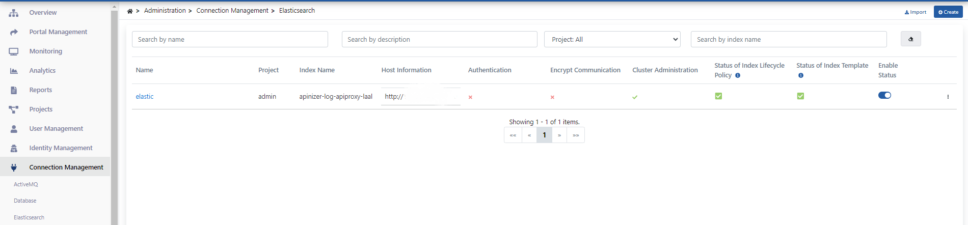
Integration of Apinizer API Traffic Logs with Kibana
Kibana enables the creation of many different types of graphs, including data tables, timelines, heat maps, bar charts, area charts, and more. Operations begin by selecting the most appropriate visualization format according to the purpose of use.
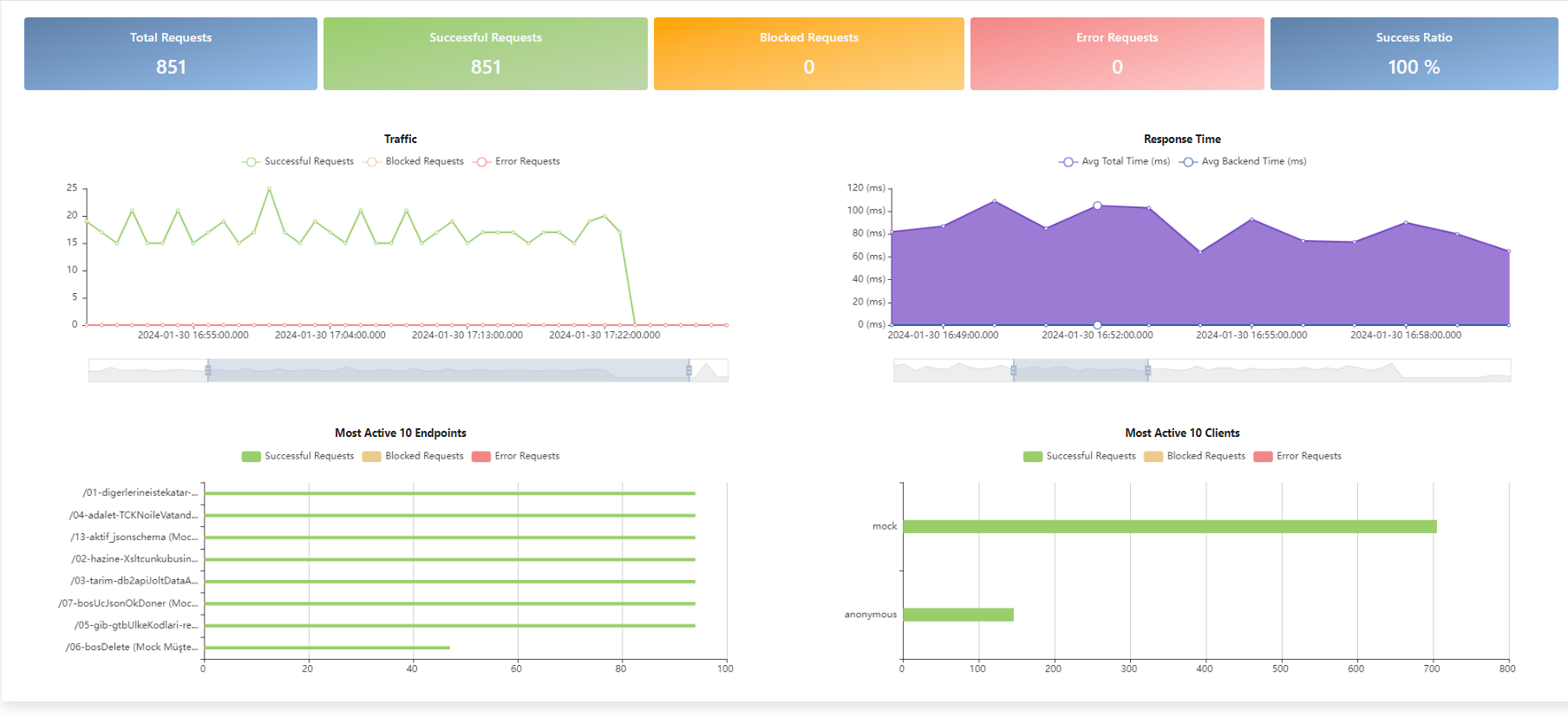
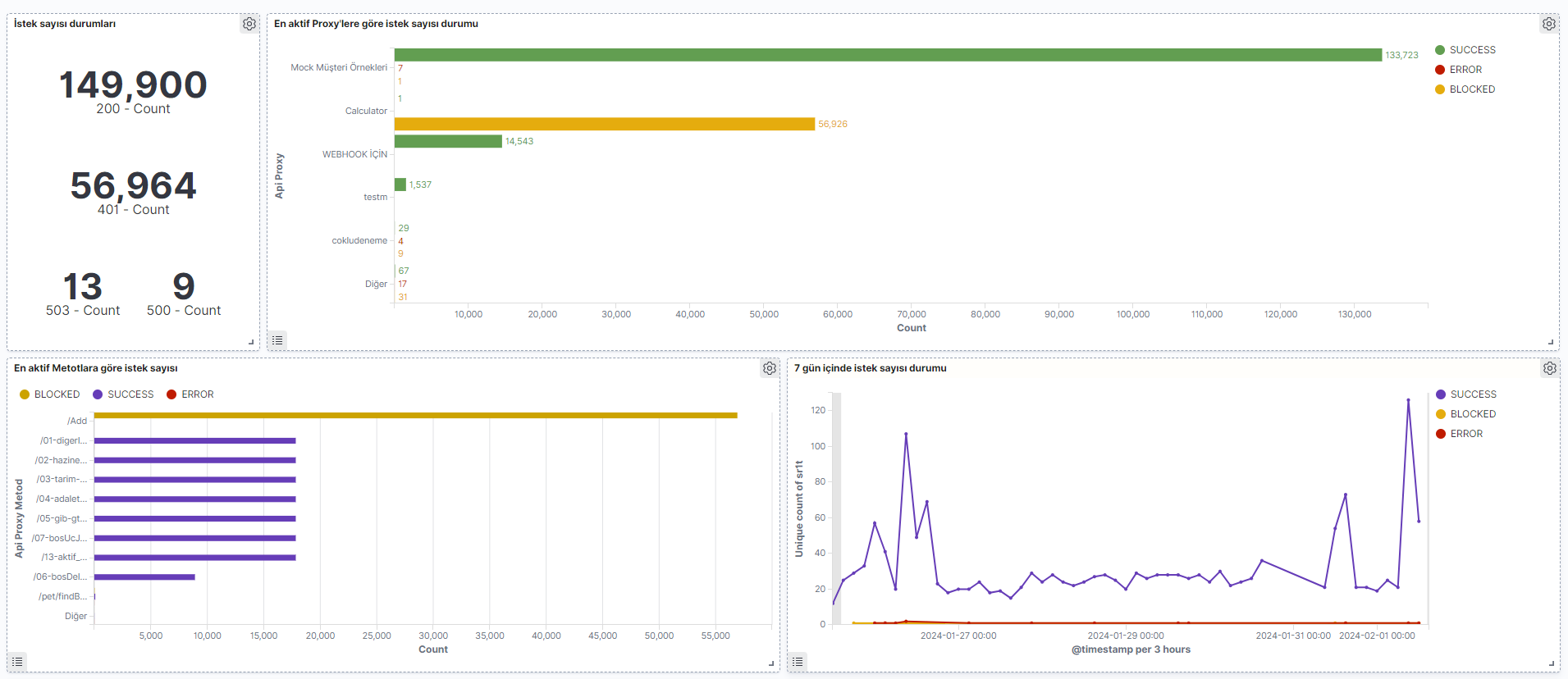
Apinizer Overview section provides the ability to display general information about API Proxies, total request counts, and successful, failed, and blocked requests on a single page. This section allows users to easily monitor and manage API traffic.
Thanks to Kibana integration, users can create customized reports in addition to general information and examine API traffic in more detail. This enables users to understand API performance and make improvements. Below is shown how several Kibana Visualize and Dashboard examples, created similar to the Apinizer Overview section, are prepared.
For the Template Data Structure Table, you can visit the Elasticsearch Manual ILM Policy and Template Creation page and see the description of data stored by field name in ILM Policies.
Creating Visualizations and Dashboards
Visualizations created with Kibana are brought together in a visualization panel to provide a general indicator of existing data and more customized data in the Apinizer Overview section.
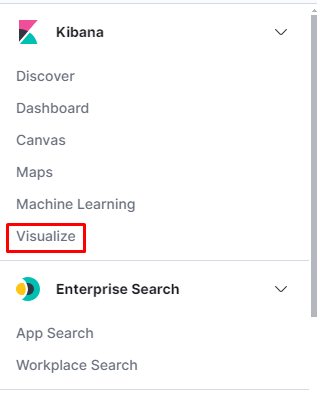
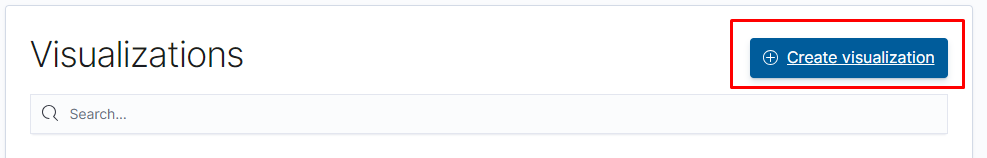
To create this visualization, click the 'Visualize' link from the left menu.
Then, click the "Create Visualization" button.
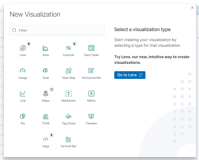
Select the desired chart creation format.
Example Chart Creation
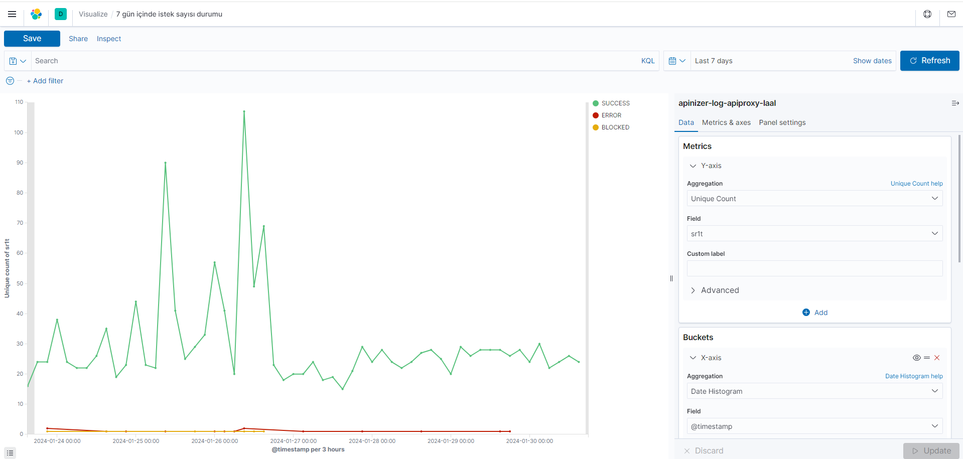
Creating a chart showing request count status within 7 days
The chart showing the status of request counts within the last 7 days is grouped by time range (timestamp). For each time range, the unique request count in the Size Request Total field has been calculated using the unique count metric. Additionally, which statuses exist in the dataset according to the Result Status term are shown.
| Field | Aggregation | Elasticsearch Index Field Name for Query |
|---|---|---|
| Metric (Determining size) | Unique Count | sr1t(Size Request Total) |
| Buckets (Which Information Will Be in Dataset) | Date histogram | @timestamp(For time range data) |
| Terms | rt(Result Status) |
- Enter the s1rt (request size) metric in the Metrics field to determine the count of unique items. The count of unique items provides information about the diversity and general summary of the dataset's content.
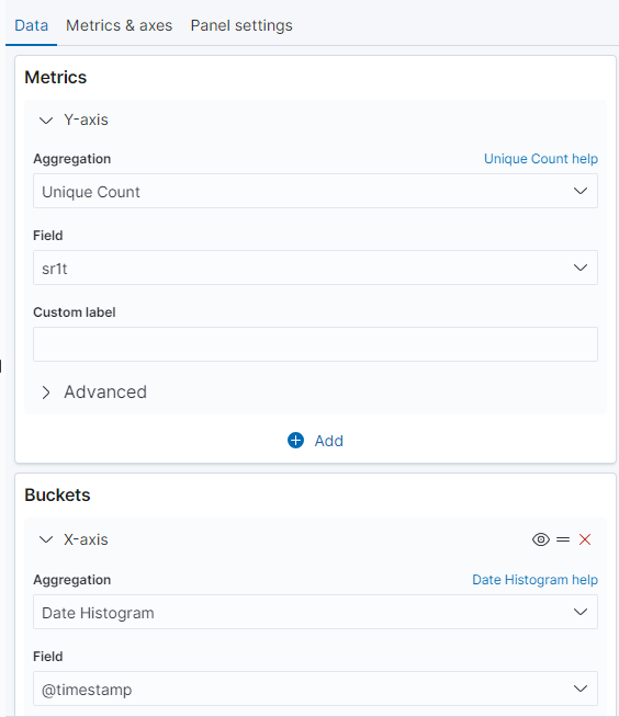
- To show the status of request counts in a 7-day time period, the Date Histogram metric is used together with the @timestamp field, and the x-axis is determined by this time range. To group results, statuses are grouped using the Terms term in the Split Series section according to frequently encountered values. This method is used to visualize the distribution of requests over time and the distribution of different statuses.
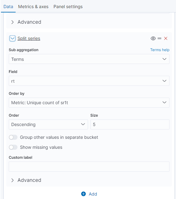
- By following the steps, it visually represents which statuses occur how frequently in a specific time period.
Creating a chart showing request count status by methods
The chart is grouped by API Proxy Method names and shows the request count for each method. Additionally, it is stated that different result statuses are also shown for each method.
| Field | Aggregation | Elasticsearch Index Field Name for Query |
|---|---|---|
| Metric (Determining size) | Count | - |
| Buckets (Which Information Will Be in Dataset) | Terms | apmn(API Proxy Method name) |
| Terms | rt(Result Status) |
- Use Count in the Metrics field to determine the total method count in the dataset, and do not specify a field.
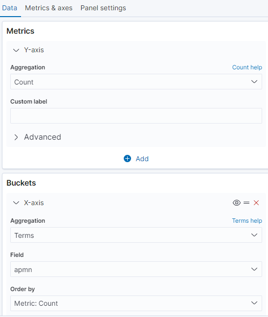
- Use apm (API Proxy Method name) in the Buckets field to make determinations for the x-axis. To group results, statuses are grouped using the Terms term in the Split Series section according to frequently encountered values.
- By following the steps, it visually presents request status grouped by API Proxy Method names and for each method.
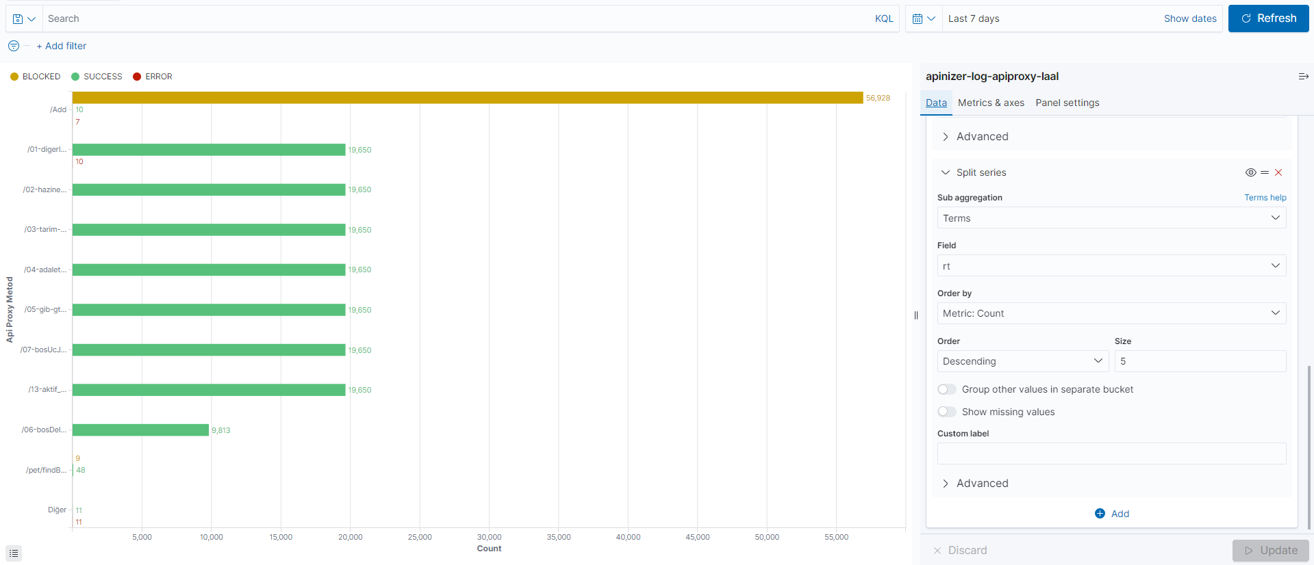
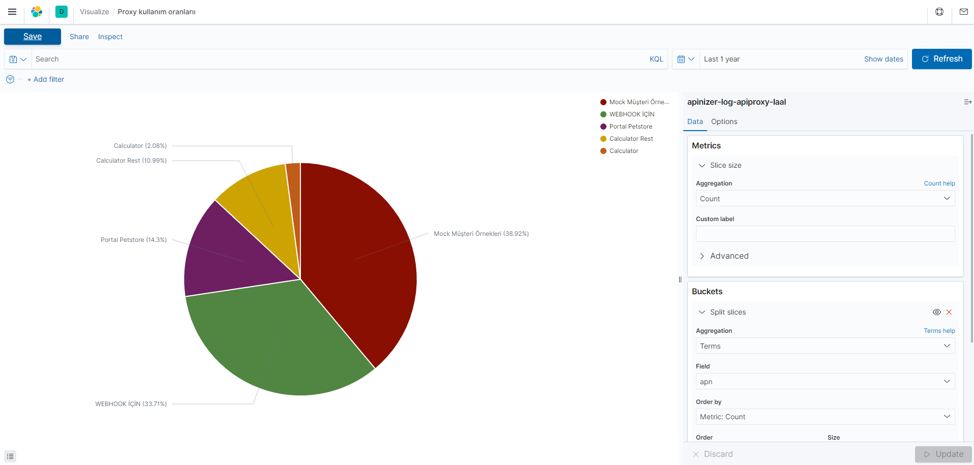
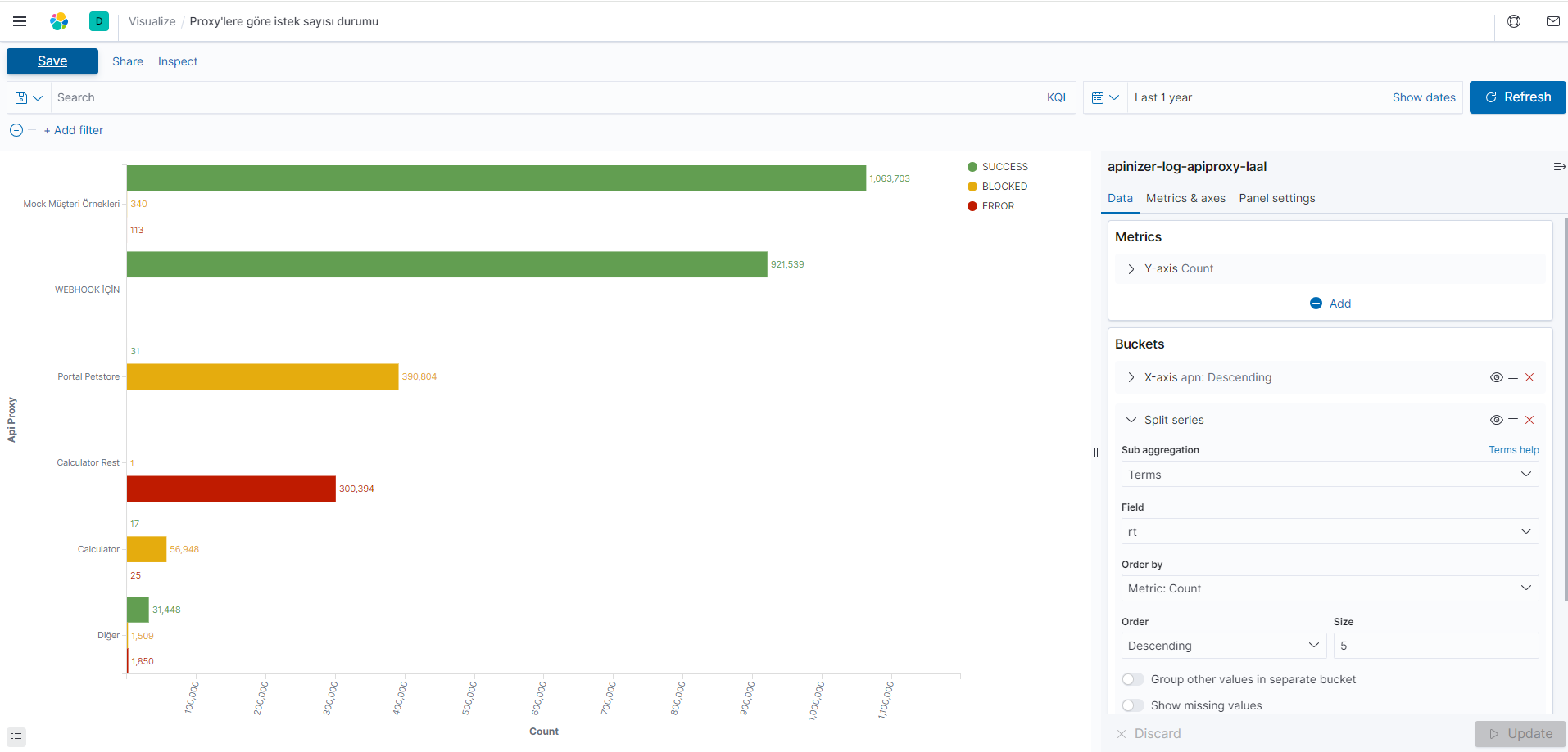
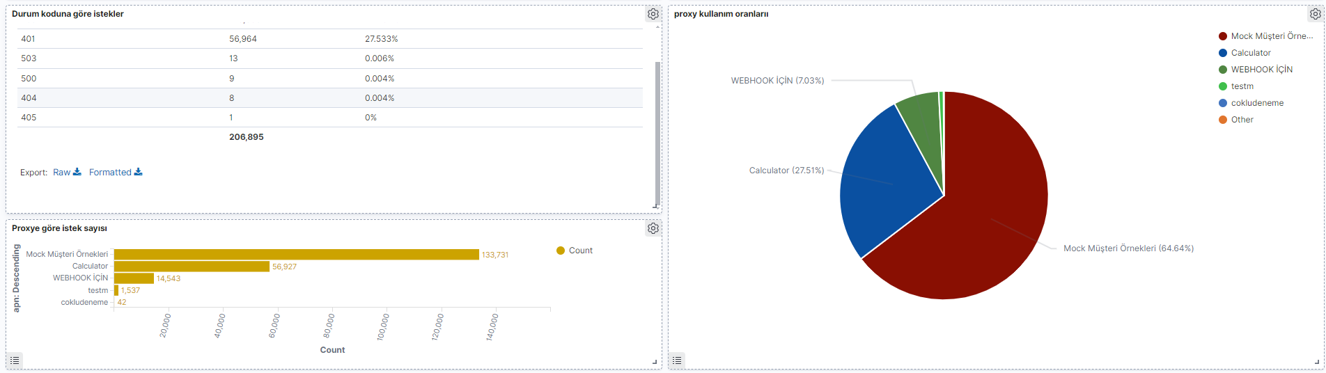
Creating a chart showing API Proxy usage rates
The chart is grouped by API Proxy names and shows the usage count for each API Proxy. This chart can be used to determine which API Proxy is used more.
| Field | Aggregation | Elasticsearch Index Field Name for Query |
|---|---|---|
| Metric (Determining size) | Count | - |
| Buckets (Which Information Will Be in Dataset) | Terms | apn(API Proxy name) |
- Use Count in the Metrics field to determine the total API Proxy count in the dataset, and do not specify a field.
- Proxies are grouped using the Terms term in the Split Series section.
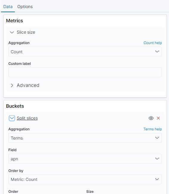
- apn and limitations about how many API Proxies there will be are shown in the Buckets field according to API Proxy names. The Metrics section is where the slice size is determined.
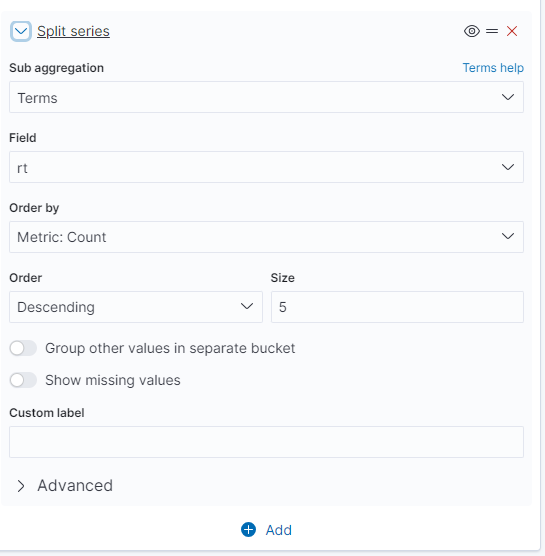
Creating a chart showing request count and status by API Proxies
This chart shows which statuses API Proxies are more frequently associated with. For example, it can be used to determine in which statuses an API Proxy fails more frequently or in which statuses it is more successful.
| Field | Aggregation | Elasticsearch Index Field Name for Query |
|---|---|---|
| Metric (Determining size) | Count | - |
| Buckets (Which Information Will Be in Dataset) | Terms | apn(API Proxy name) |
| Terms | rt(Result Status) |
- Use Count in the Metrics field to determine the total API Proxy count in the dataset, and do not specify a field.
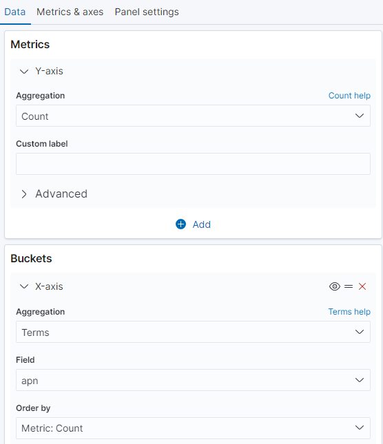
- Use apn(API Proxy name) in the Buckets field to make determinations for the x-axis. To group results, Result statuses are grouped using the Terms term in the Split Series section according to frequently encountered values.
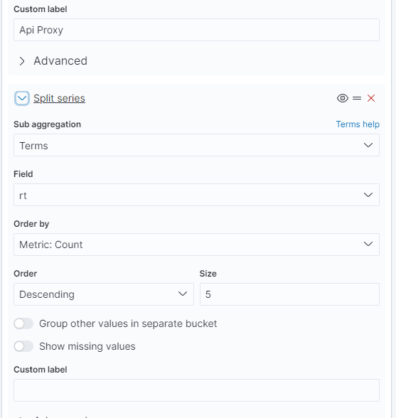
- By following the steps, it visually presents request status grouped by API Proxy names and for each Proxy.
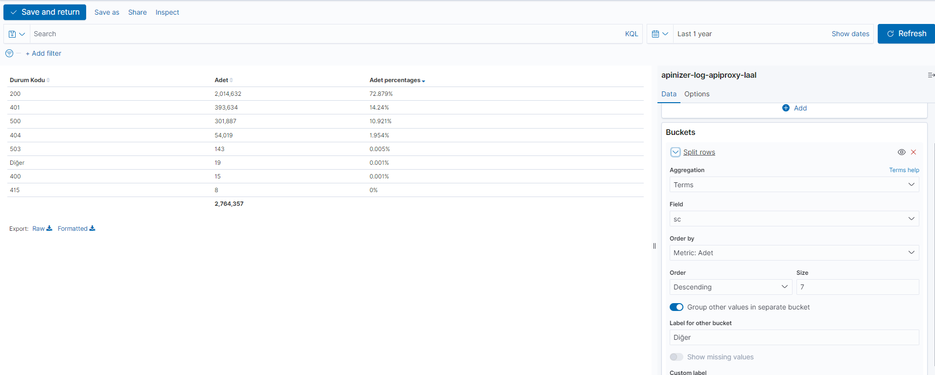
Creating a Histogram chart showing requests by status code
This histogram chart will show the count of requests by status codes. By determining how many requests occurred for each status code, you can visualize the distribution of requests. This way, you can observe which status codes are more or less frequent.
| Field | Aggregation | Elasticsearch Index Field Name for Query |
|---|---|---|
| Metric (Determining size) | Count | - |
| Buckets (Which Information Will Be in Dataset) | Terms | sc(Status Code) |
- Use Count in the Metrics field to determine the total request count in the dataset, and do not specify a field.
- Use sc in the Buckets field to determine the status code according to total request count.
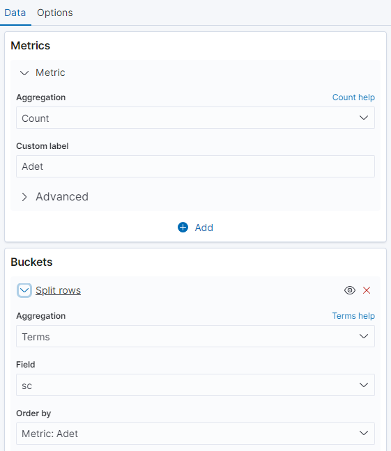
- This visualization clearly shows the count of requests with different status codes. For example, it can include the ratio of requests with status code 200 (Success) within total requests, the count of requests with status code 404 (Not Found), the count of requests with status code 500 (Server Error), etc.
Creating Dashboard and Adding Visualizations
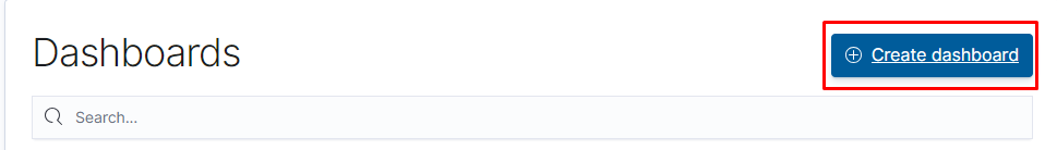
Click the "Dashboard" link from the left menu.
Click the "Create Dashboard" button.
The area marked in red is used to add any created visualization.
The area marked in green is used to create a new visualization and add it to the dashboard.
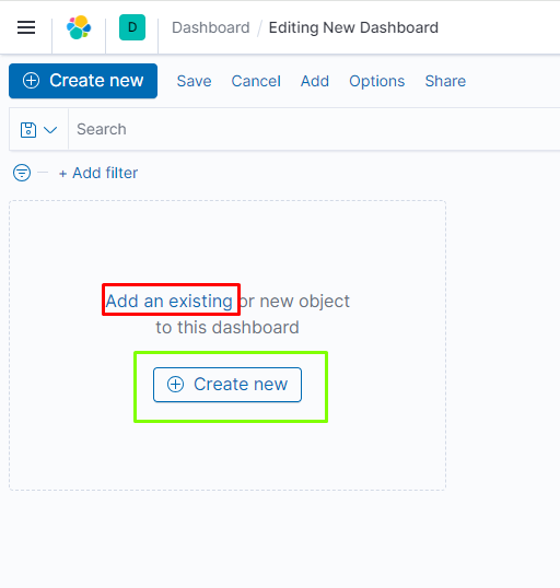
The process of adding saved visualizations to the dashboard.
Data Analysis and Filtering Process
This section enables analyzing data stored in indices, obtaining detailed information about the structure of each field, and visualizing findings. Additionally, searches can be personalized, saved, and these customized search and filtering options can be placed in a control panel.
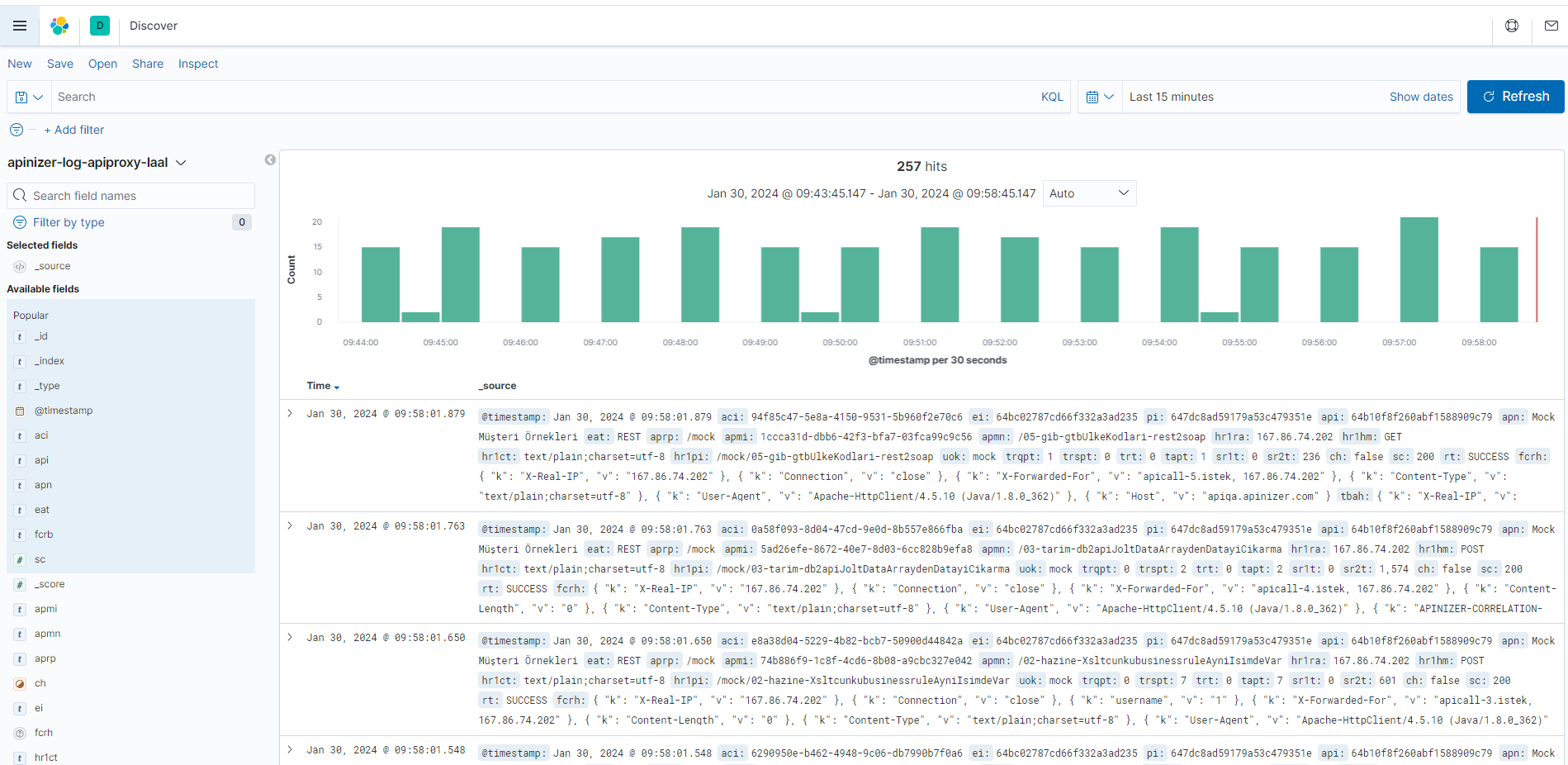
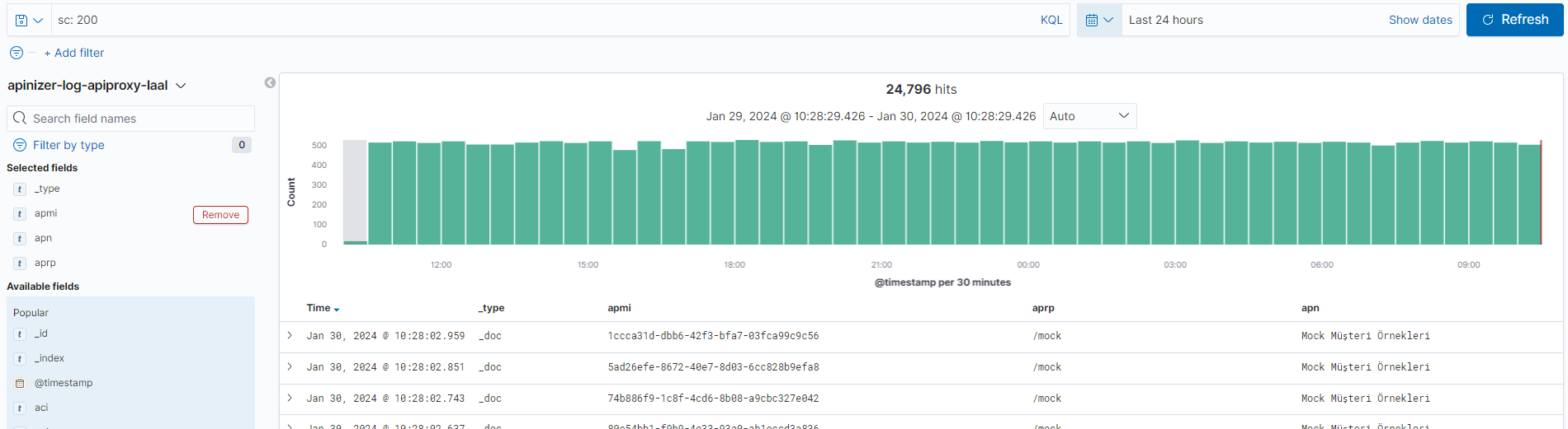
There is a chart showing the total request count within the last 15 minutes. Below the bars is a list of Elasticsearch documents.
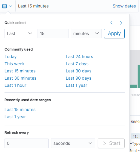
Filtering by time range can be performed optionally and visualized.
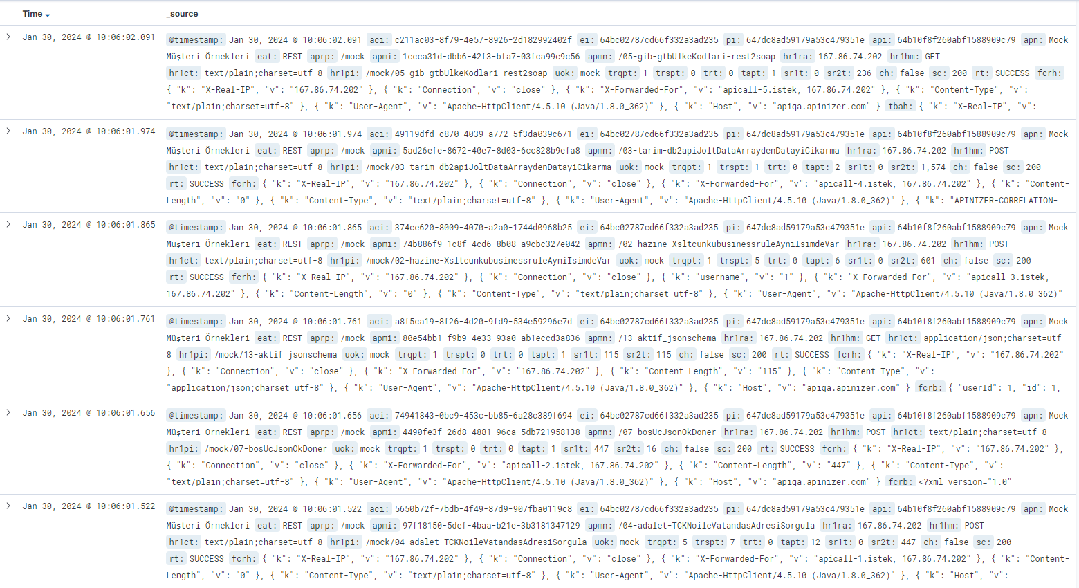
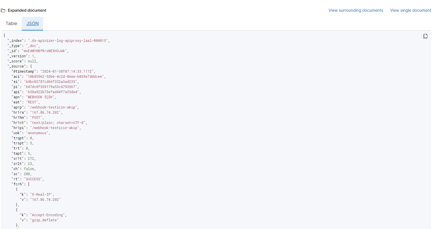
All fields can be displayed row by row along with the data. By clicking the arrow icon to expand a row, details are provided in table format or JSON format.
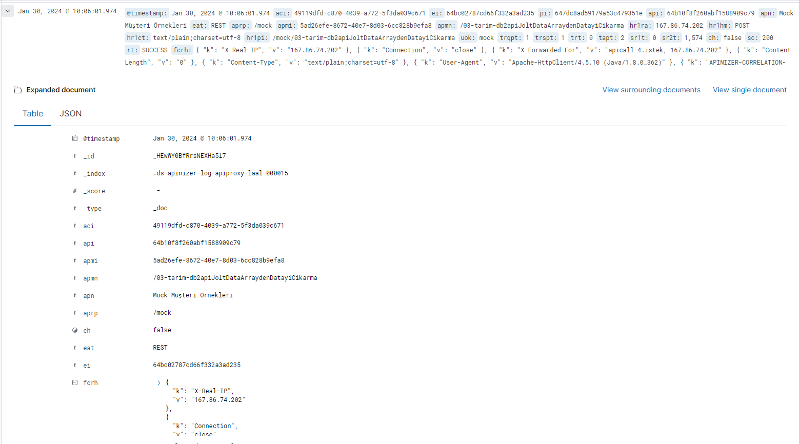
JSON Format
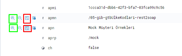
Desired data can be put into table format. When you click the box marked in red to expand one of the rows, it adds that data in table format.
If you click the box marked in green, it can be used to filter data. This functions like a KQL (Kibana Query Language) query.
KQL is the query language used for searching and analyzing data stored in Elasticsearch. When simple queries are written, they are automatically converted to Elasticsearch DLS Query format in the background and searched. Complex Elasticsearch queries can be performed using KQL in a single line.
Querying successful request count within the last 24 hours (sc:200)
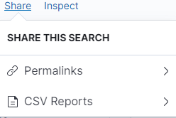
After search data is saved, it can be shared with others with different sharing types using the share button in the upper right corner.
For the Template Data Structure Table, you can visit the Elasticsearch Manual ILM Policy and Template Creation page and see the description of data stored by field name in ILM Policies.