From Noise to Insight: Diagnostic-Oriented API Dashboard Architecture in Kibana
In today's software architectures, for systems running under high traffic and heavy load - in short, across the entire IT world - one of the most critical questions is: "What is happening in my system right now, and can I actually see it in real time?"
With the widespread adoption of distributed systems, microservice architectures, and high-traffic APIs, even a single transaction can pass through dozens of services, leaving behind a massive pile of logs. At this scale, daily log volume can reach millions, even billions, of lines. At this point, simply producing logs is not enough; because for a team that cannot reach the right data in time, those log lines turn into noise rather than a solution.
What truly matters is being able to make sense of this enormous volume of data, to catch trends and anomalies early, to analyze system behavior in real time, and to detect problems before they reach the customer. Otherwise, a single error can turn into a manual search process that drags on for hours through the logs, resulting in serious time and reputation loss.
Getting lost among millions of log lines can be a choice, but turning this data into meaningful trends, visualizable metrics, and actionable insights is no longer an option - it's a necessity. And one of the most powerful tools that lets us fulfill that necessity is: Kibana.
In this article, without drowning in the copy-paste details of a Kibana installation (for those curious, I'm leaving a nice setup guide at the end), we'll go straight to the heart of the matter. We'll cover, with practical examples, how dashboards are built in Kibana, the power of Elastic queries, and the contribution this kind of visualization brings to our operational processes.
Now, to get the formalities out of the way, let's define Kibana.
Kibana is a web-based user interface and management panel used to search, analyze, visualize, and manage data stored across the Elastic Stack. It allows us to view, inspect, and manage different data sources from a single place.
Kibana is a web-based, open-source platform that forms the visualization and data-analysis layer of the Elastic Stack ecosystem. It enables data stored in Elasticsearch to be queried, analyzed, visualized, and managed through a user-friendly interface.
The Kibana installation guide I mentioned; you can visit this link.
Part 1: The Right Metric, the Right Action: Choosing KPIs for API Monitoring
Kibana lays out hundreds of different log fields in front of us that we could visualize. But one of the biggest mistakes made when designing a dashboard is turning every single piece of system data into a random chart just because "we can visualize it."
Having a lot of charts on the screen doesn't mean we're monitoring the system well. On the contrary, in the middle of a crisis, we might miss the one piece of data that truly matters, buried under this "data noise." The success of a dashboard lies in whether the person looking at it can tell, within the first few seconds, whether there's a problem and, if so, where it's coming from.
That's why, before starting to build dozens of dashboards in Kibana, it's a better approach to first ask this question and build dashboards based on the answer: "What measurements would actually prove to me that my system is healthy and performing well?"
This is exactly where KPIs come to our rescue, helping us identify the right metrics without much difficulty.
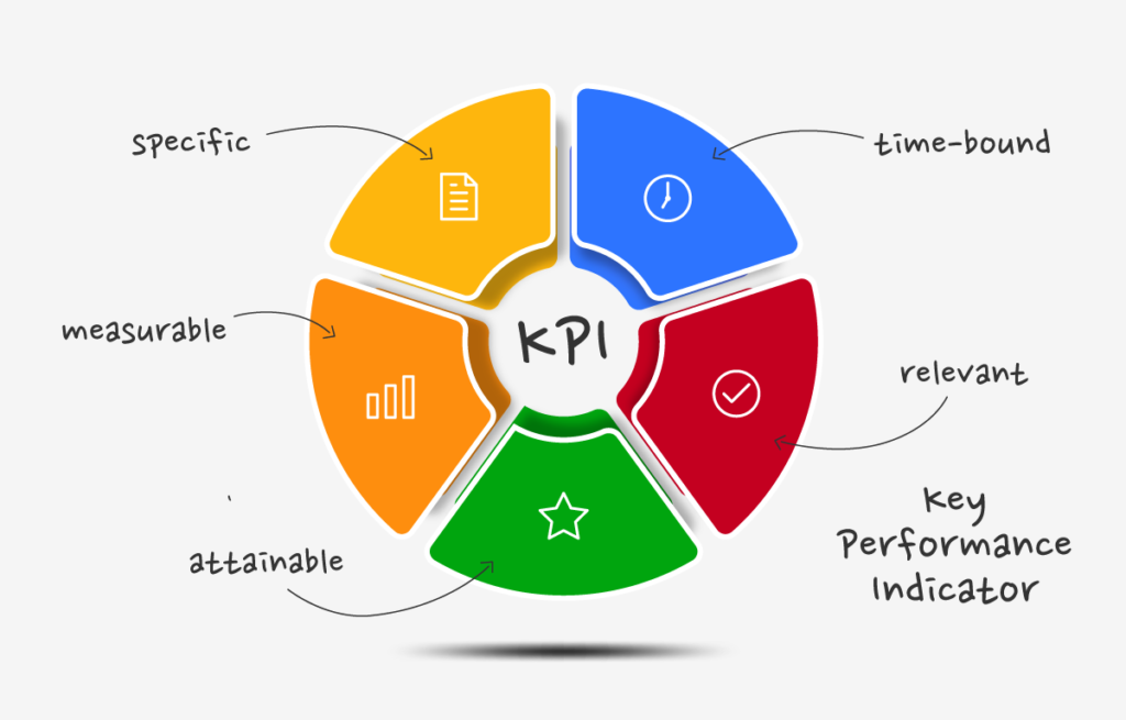
Key Performance Indicator (KPI)
The first question we need to ask before building a dashboard is: "What do I want to measure?" This is where KPIs come into play.
A Key Performance Indicator (KPI) is a measurable criterion that reveals the success, performance, and reliability of a system, API, or service, along with its contribution to business processes.
Tracking the right KPIs is vital for identifying a system's bottlenecks in advance.
| KPI | What does it answer? |
|---|---|
| Response Time / Request Pipeline Time | API response times and the breakdown of where that time is spent across internal components (gateway, network, backend) |
| Average Request/Response Size | Average payload sizes to catch anomalies in data volume |
| Success & Error Rate | How do 2xx / 4xx / 5xx ratios behave instantaneously and historically? |
| Response Size vs Response Pipeline Time | How do large payloads affect response time? |
| Top N Slowest Requests | Which endpoints strain the system the most? |
| HTTP Status Code Distribution | How is traffic distributed across status codes? |
| Throughput (RPS) | How many requests does the system handle per unit of time? |
| Error Budget / SLA Compliance | How close/far are we from the defined SLA target (e.g. 99.9%)? |
Before adding a KPI to a dashboard, ask yourself: "What will I do when this chart triggers an alarm?" If there's no clear action plan for that question, that KPI probably doesn't belong on the dashboard - it should stay as raw data in Discover.
Part 2: Visualization Strategy: Which Chart for Which Metric?
The point of building a dashboard is not just to gather data on a single screen, but to produce meaningful insights from that data. The same dataset, when visualized with the wrong chart type, can hide important information or lead the viewer to faulty conclusions. That's why the right visualization choice sits at the core of data visualization.
Every chart type serves a specific analytical need. Let's go over which chart types Kibana offers and which ones are suited for which situations.
1) Line Charts
Line charts are the most common visualization type used to track metrics that change over time. They make it especially easy to spot increases, decreases, and sudden changes over a given period. That's why they're one of the most frequently used charts on dashboards.
Use Cases
- API Response Time
- API Request Time
- Requests Per Second
Example Scenario
Let's say we have a Line Chart showing an API's average response times over a 24-hour period. Assume the response time, which hovers around 150 ms for hours, suddenly spikes to 2.5 seconds.
This sudden spike could point to a database bottleneck, a surge in traffic, a slowdown in the backend service, or delays in external service dependencies. That's why Line Charts don't just display metrics - they also let us quickly pinpoint exactly when an anomaly in the system began.
Tip: If you're examining time-series data, a Line Chart should be your first choice of chart type.

2) Bar Charts
Bar charts are one of the most basic and readable visualization types used to compare numeric values across different categories. Kibana allows you to build vertical or horizontal bar charts. They perform especially well when comparing categorical data such as services, endpoints, clients, or HTTP status codes.
They're great at quickly answering questions like "Which one is highest?", "Which service produces the most errors?", or "Which client generates the most traffic?". Bar charts are among the best visualizations for this kind of comparative analysis.
Use Cases
- HTTP Status Code Distribution
- APIs receiving the most requests
- Endpoints producing the most errors
- Request counts by service
Example Scenario
You might want to observe which API produces more errors relative to others, how many errors it has, and the HTTP status codes of those errors.
In such a case, a bar chart with the API service names on the X-axis and HTTP status codes on the Y-axis would let you identify which API is causing problems within seconds.

3) Pie & Donut Charts
Pie and donut charts are visualization types used to show the proportion of parts that make up a whole. The goal is to present, quickly and clearly, how much share each category holds within the total data. In Kibana, they're frequently used to analyze traffic distributions, HTTP status codes, or request types as percentages.
These charts excel not at comparing absolute numbers, but at showing distribution and proportion. That's why they can answer questions like "What percentage of total traffic was successful?" or "Which HTTP method accounts for the majority of requests?" at a single glance.
Use Cases
- HTTP Status Code Distribution
- HTTP Method (GET, POST, PUT, PATCH, DELETE) Ratios
- Successful vs. Failed Request Percentages
- API Consumers' Share of Total Traffic

Part 3: From Theory to Practice — Building a Dashboard in Kibana Step by Step
Let's set the theory aside and look at how we turn KPIs into live projects in Kibana. When building a dashboard in Kibana, we typically use either Lens or Discover mode. We'll go with the more flexible and modern approach: Kibana Lens.
Step #1: Selecting the Data View (Index Pattern)
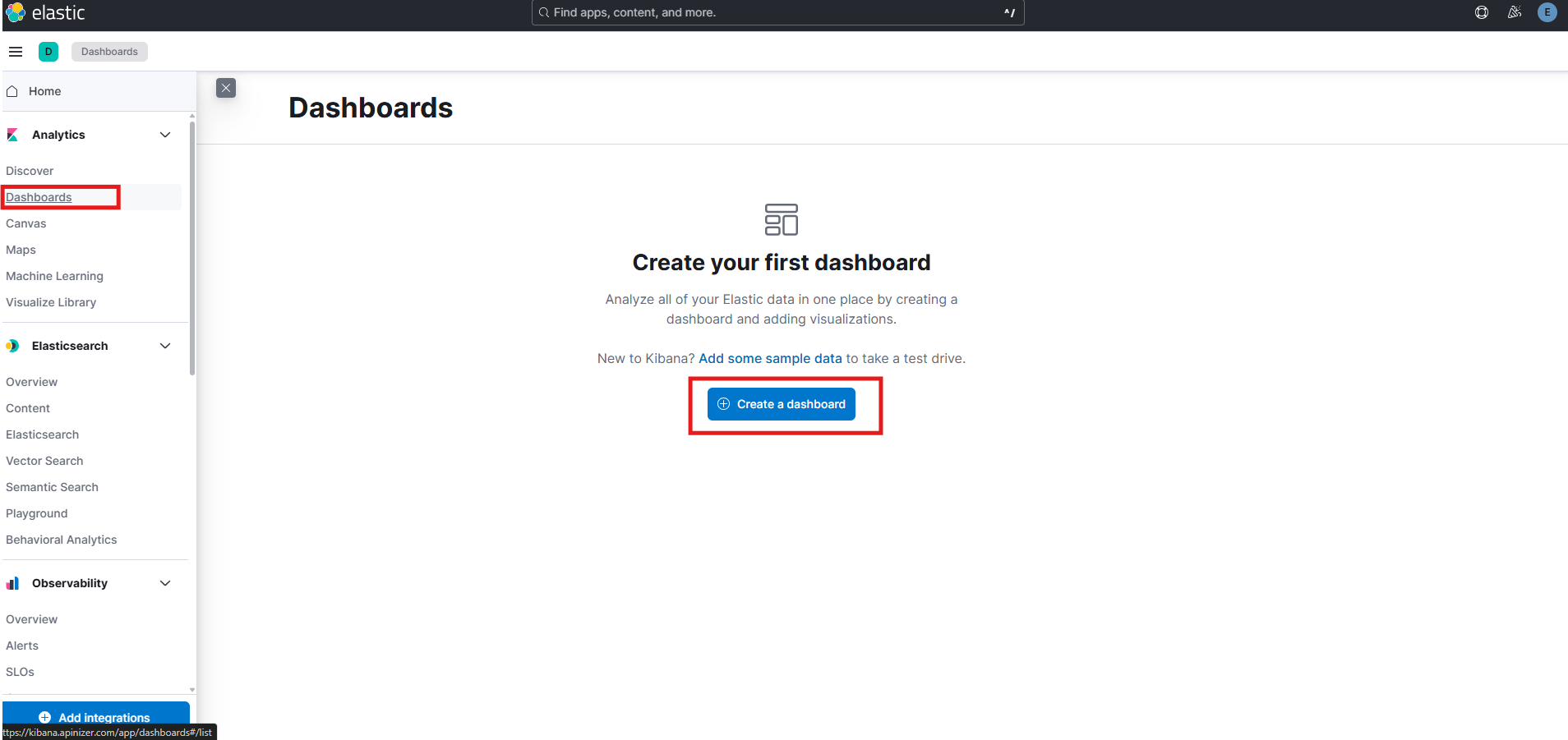
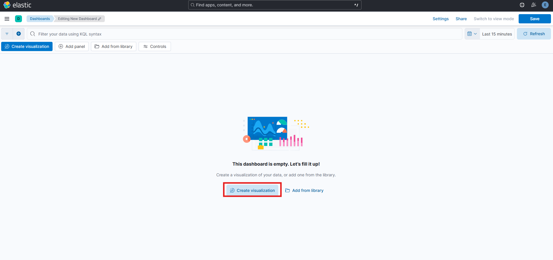
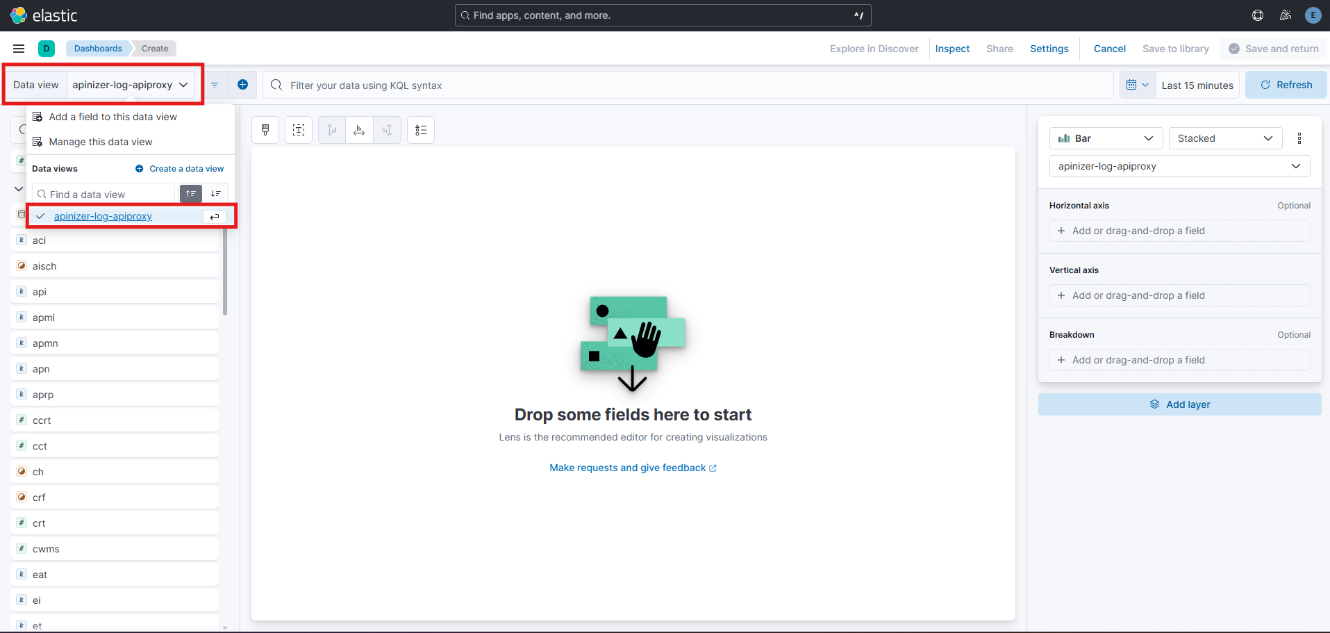
In the Kibana interface, go to the Analytics > Dashboard section in the left menu and click "Create Dashboard." Then click "Create visualization" to open the Lens screen. The first thing you need to do is select the correct "Data View" (formerly known as Index Pattern) from the top-left corner - the one your logs are flowing into (for example: api-traffic-logs-*).
Step #2: Choosing the Visualization Type (Chart) (Bar/Line/Donut)
After selecting the Data View, the Lens screen presents you with the visualization type selection. In the panel on the top-right of the screen, you'll see many options like Bar, Line, Area, Donut, Pie, Table, and Heat Map. At first glance, this variety can be confusing; but once you ask the right question, the choice actually becomes quite clear.
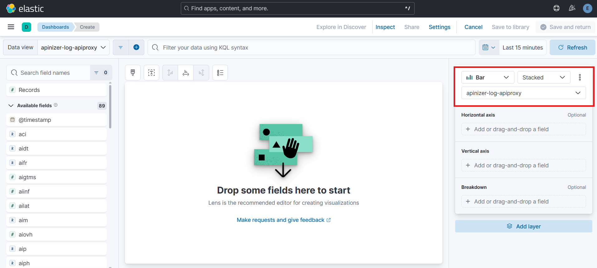
The question you should ask is: "What am I trying to say with this data?"
KPIs act as a guide here. Because each KPI actually addresses a different monitoring need, and each monitoring need is more clearly understood through certain charts:
- Are we tracking a change over time? (e.g. Response Time fluctuating by the hour, Requests Per Second rising and falling throughout the day) → Line Chart
- Are we making a comparison between categories? (e.g. Which endpoint produces the most errors, which service receives the heaviest traffic) → Bar Chart
- Do we want to see how a whole is divided into parts? (e.g. Percentage distribution of HTTP methods, ratio of successful/failed requests) → Donut/Pie Chart
- Do we want to show change over time while also emphasizing volume? (e.g. How total traffic volume grows while the error rate also evolves) → Area Chart
There's a small but important distinction worth paying attention to here: Line Chart and Area Chart are often confused with each other. Both show time series, but an Area Chart fills the area under the graph, also emphasizing volume. If you only want to show a trend (rise/fall), a Line Chart is enough; but if you also want to answer "how large is the volume behind this trend," an Area Chart is the better choice.
Kibana Lens's Smart Suggestion System (Suggestions)
As you select your fields (X-axis, Y-axis, break down, etc.), small preview cards called "Suggestions" appear at the bottom of the screen. Based on the type of data you've selected, Kibana suggests alternative visualizations, essentially saying "this chart is probably more meaningful for this kind of data." For example, when you select a date field and a numeric metric, Lens automatically offers a Line Chart as the top suggestion; when you select a categorical field, a Bar Chart takes priority instead.
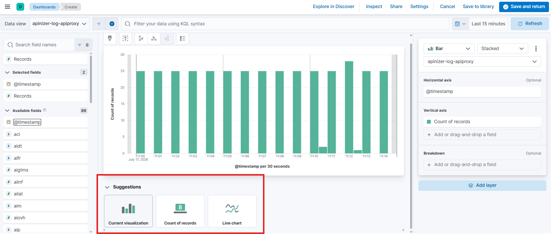
Step #3: Selecting Metrics and Fields, Aggregation (avg, sum, count)
Once you've chosen the chart type, the next question becomes "which data will we summarize, and how, to display it." Since I'll be working with Apinizer API Gateway logs for my example dashboard, I'll build my dashboards by referencing the Apinizer log structure.
I expect that the log fields you'll see in the rest of the article won't mean much to you as readers. To answer questions like which field refers to which data, what each field's data type is, and why a particular field was used, you can check out the Apinizer Log Structure by clicking here.
Let's start by clarifying the questions we want to answer / the metrics we want to track:
Each question below will come to life as a separate panel/widget on the dashboard:
- Traffic Volume: What is the total number of requests made to the APIs in the last 24 hours? (Time series chart)
- Distribution by Service: Which API/service is called the most? (Pie or bar chart — grouped by service name)
- Distribution by Endpoint: Which endpoints are called the most?
- Error Rate: What is the distribution across HTTP status codes? (How does the 4xx / 5xx ratio change over time?)
- Slow Endpoints: Which are the top 10 endpoints with the highest response time? (Top N table)
- Average Response Time (Latency): How does the average/95th percentile response time change over time?
- Consumers/Clients With the Most Errors: Which API key or client receives the most 4xx/5xx responses? (Potential misuse/integration-error detection)
- Clients Hitting Rate Limits Most Often
- Busiest Hours
While building these charts, there are a few fields we'll use across all of them. Before diving into the charts, I want to mention these first:
- Metric (Y-axis)
- Bucket (X-axis / break down)
Metric (Y-axis) — "What are we measuring?"
When you drag a field into the metric slot, Kibana lists the aggregation functions that can be applied to it:
- Count: Counts how many documents (log records) arrived within a given time window. Ideal for traffic-volume metrics like Requests Per Second.
- Average (avg): Takes the average of a numeric field. For the
response_timefield, Average answers the question "on average, how fast do our APIs respond?" - Sum: Calculates the total value. For example, it can be used for total response size (
response_size). - Median / Percentile (p50, p95, p99): An average alone can be misleading; a handful of outliers can pull the average up. That's why percentile metrics like p95 or p99 are preferred in performance analysis; they paint a much more realistic picture, such as "95% of requests complete under this duration."
- Unique Count (Cardinality): Gives the number of unique values in a field. It answers the question "how many distinct users called this API?"
- Min / Max: Shows the lowest and highest values; useful for detecting instantaneous spikes.
Bucket (X-axis / Break down by) — "How will we group it?"
- Date Histogram: Splits data into time intervals (minute, hour, day); forms the basis of Line and Area Charts.
- Terms: Groups data by the most frequent values of a categorical field (for example
service.keyword,status_code); forms the basis of Bar and Pie/Donut charts. - Filters: Lets you create custom groups based on your own KQL expressions (for example, defining two groups as "Successful" and "Failed").
- Range: Splits a numeric field into ranges you define (for example, grouping response time into
0-100ms,100-500ms,500ms+).
In short, Kibana Lens is driven by the trio of the right Data View, the right Metric (aggregation), and the right Bucket (grouping).

But defining our data and metrics one by one is only half the picture. The real operational win comes from combining these panels - not by scattering them randomly across the screen, but in a structure that reduces cognitive load during a crisis.

Now let's turn this theoretical foundation into a real, 4-layer dashboard architecture built on Apinizer API Gateway logs.
Part 4: Field Application - API Gateway Dashboard
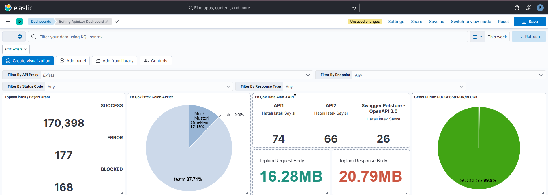
To put the theory into practice, I'm sharing the actual dashboard we built to monitor Apinizer API Gateway traffic. It runs on the apinizer-log-apiproxy-* index; at the top, you can instantly narrow down every panel using API Proxy, Endpoint, Status Code, and Response Type filters (control panel).
We didn't design the dashboard as a random stack of panels/widgets, but as four layers that complement one another: General Health Summary → Traffic Analysis → Performance Analysis → Detail Tables.
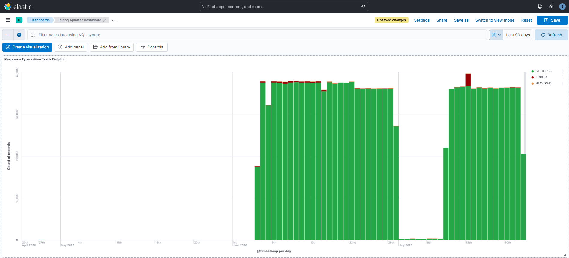
4.1 — General Health Summary: "Is the system healthy or not right now?"
This is the answer a stakeholder looking at the dashboard should get within the first 3 seconds. That's why the panels in this layer were deliberately chosen from Metric and Pie types - visuals that require no interpretation and can be read at a single glance.
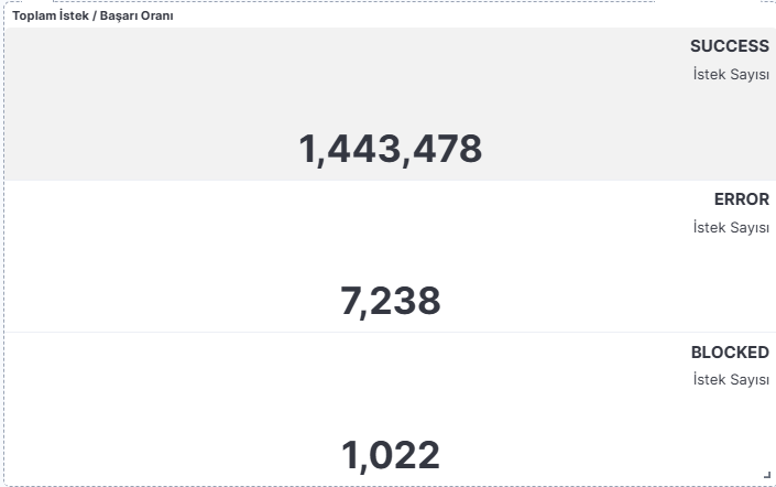
Total Requests / Success Rate
In this visualization, the rt (response type) field is used both as the Count metric and in the Top 3 values breakdown. At first glance, using the same field as both metric and breakdown might seem odd; but each serves a different purpose here. Count shows the total number of logs (i.e. total requests) within the selected time range, while Top 3 values groups the same logs by success, error, and blocked values to reveal their distribution. This way, a single visualization lets you analyze both the total request volume and how those requests break down across success, error, and blocked states.
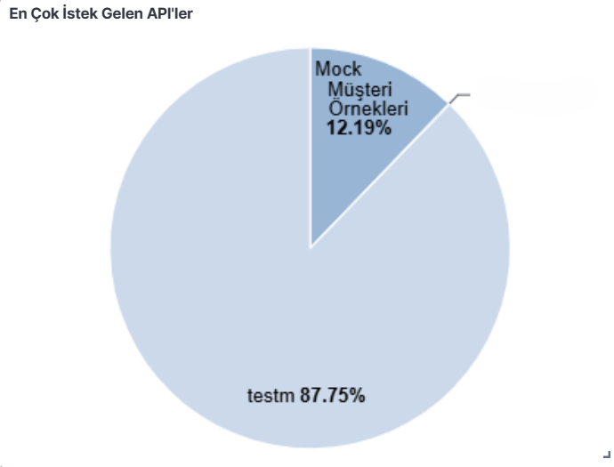
Top APIs by Request Volume
The same data, this time based on a Pie Chart field, shows APIs' share of the total request volume as a percentage. While a Bar Chart presents absolute request counts, a Pie Chart lets you evaluate the same data from a proportional perspective. This makes it easy to spot whether system traffic is concentrated on specific APIs. In the example, we can see that roughly 87.75% of total traffic is concentrated on a single API (testm). This kind of distribution provides valuable insight for capacity planning, bottleneck analysis, and monitoring high-traffic services.
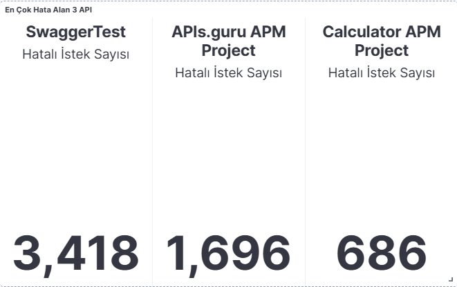
Top 3 APIs by Error Count
Using the apn (API proxy name) field's Terms breakdown together with a Count metric on rt, the top 3 services producing the most errors are listed in a single card. This panel is directly tied to the service-level breakdown of the "Success & Error Rate" KPI - knowing the overall error rate isn't enough; you also need to know which service is producing the errors.
Total Request / Response Body (Legacy Metric)
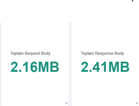
The Sum totals of the sr1t (request size) and sr2t (response size) fields are shown in two separate color-scaled (green → yellow → red) Legacy Metric cards. The color thresholds visually mark the boundary between "normal" and "abnormal" payload volume - the color of the scale itself gives you a signal without having to read the actual number.
Overall Status: SUCCESS / ERROR / BLOCKED
The color coding in this visual isn't just a design choice - it's a readability move that directly guides the user's perception. The Pie Chart grouping apn data proportionally uses dark red for the ERROR slice and green for the SUCCESS slice, letting the user instantly diagnose issues just "from the size of the red area."

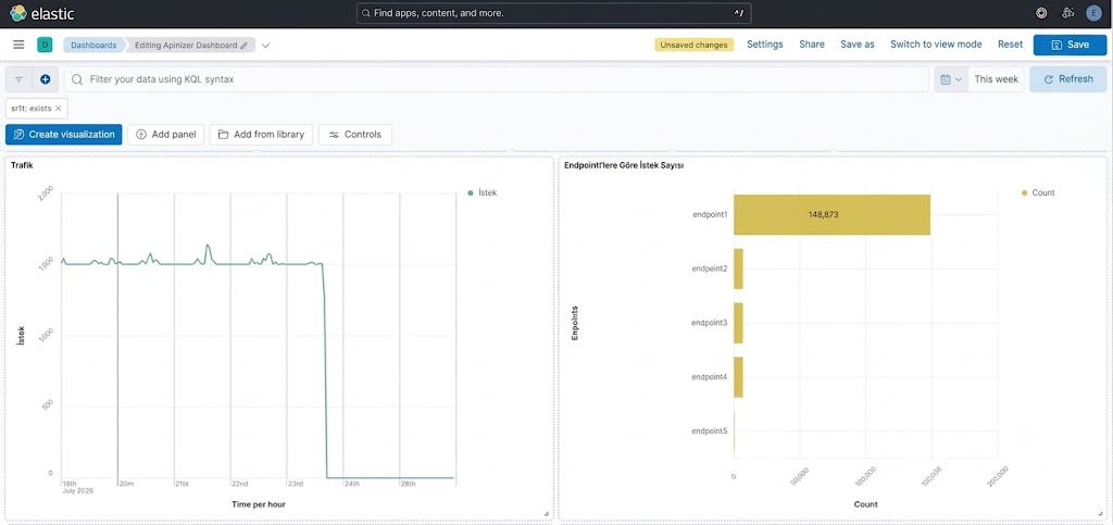
4.2 — Traffic Analysis: "How does traffic behave over time?"
After the general health summary, the next question involves the time dimension: when did an anomaly start?
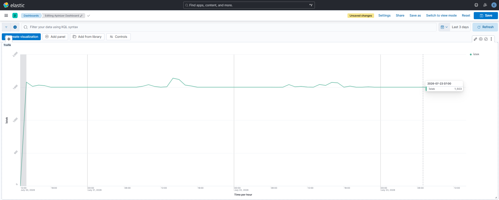
Traffic (time series)
A classic time-series chart using a Date Histogram bucket on @timestamp with a Count metric. This panel exists to catch, within seconds, situations where traffic that has been stable for hours suddenly spikes or drops - a direct application of the "change over time → Line/Area Chart" rule we mentioned in Part 2.
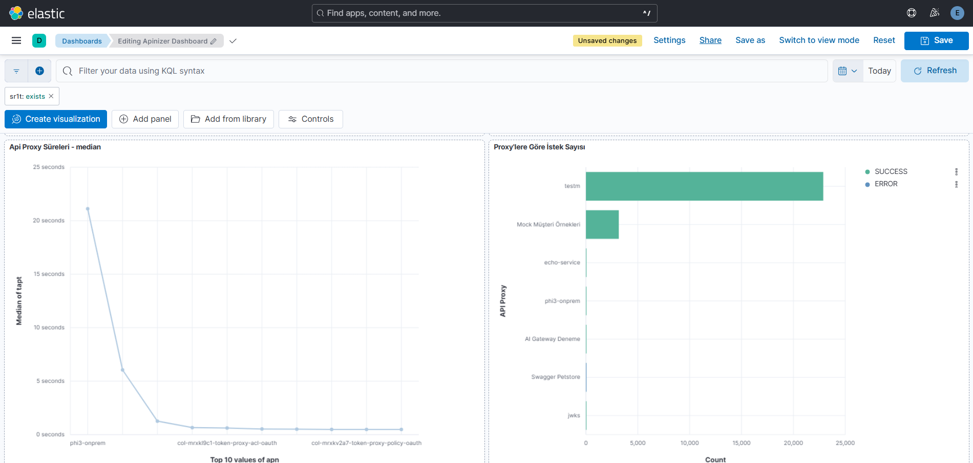
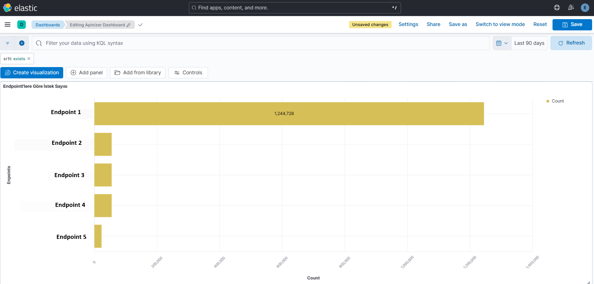
Request Count by Proxy
A Terms bucket on apn (API proxy), combined with an apmn breakdown, is displayed as a stacked bar chart. This chart exists to profile how total traffic passing through the API Gateway is distributed across API proxies and endpoints, and to identify the services with the highest request volume.
4.3 — Performance and Bottleneck Analysis: "Where is the slowness?"
This layer is where the average isn't enough, and sharper metrics like max and median come into play.
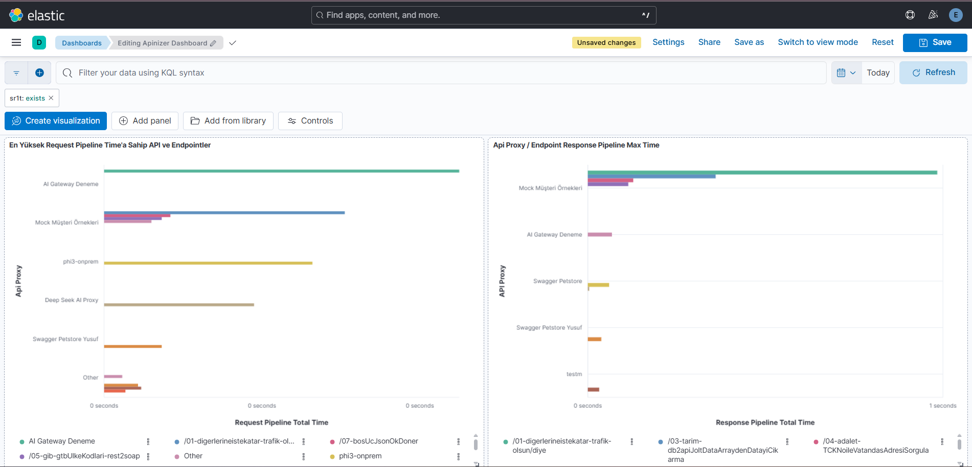
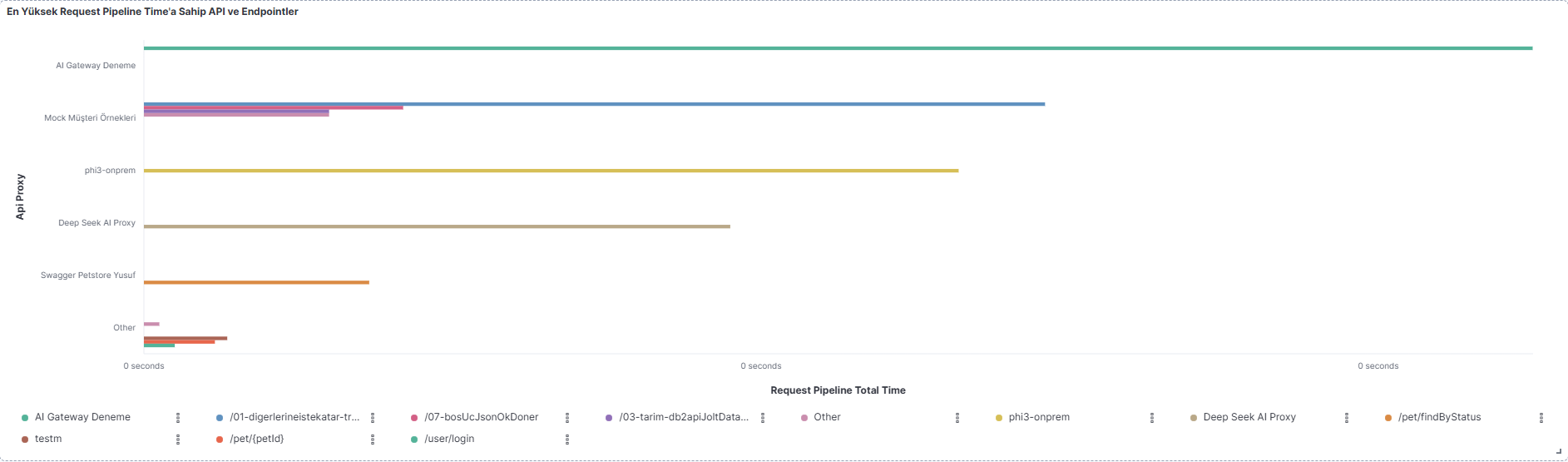
APIs and Endpoints With the Highest Request Pipeline Time
A Max metric on trqpt (request pipeline total time), broken down by apn and apmn (Top 3), is shown as a bar chart. Choosing "maximum" instead of "average" is deliberate: individual spike events that ruin a user's experience can get lost within an average.
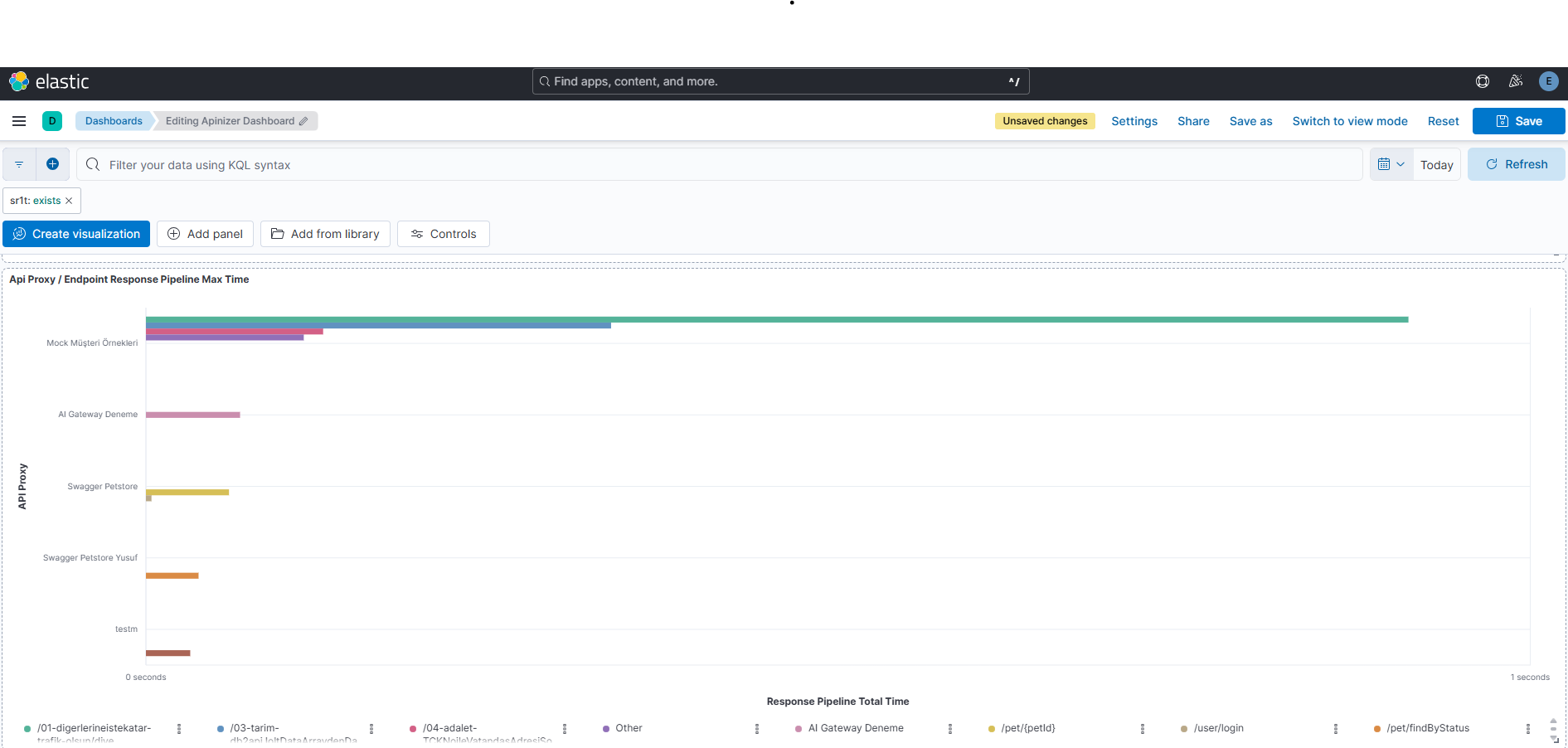
API Proxy / Endpoint Response Pipeline Max Time
The same logic is applied here to trspt (response pipeline total time). Keeping the Request and Response pipeline in separate panels matters - it lets you distinguish whether the delay is occurring on the way in to the gateway, or on the way back from the backend.
API Proxy Durations — Median
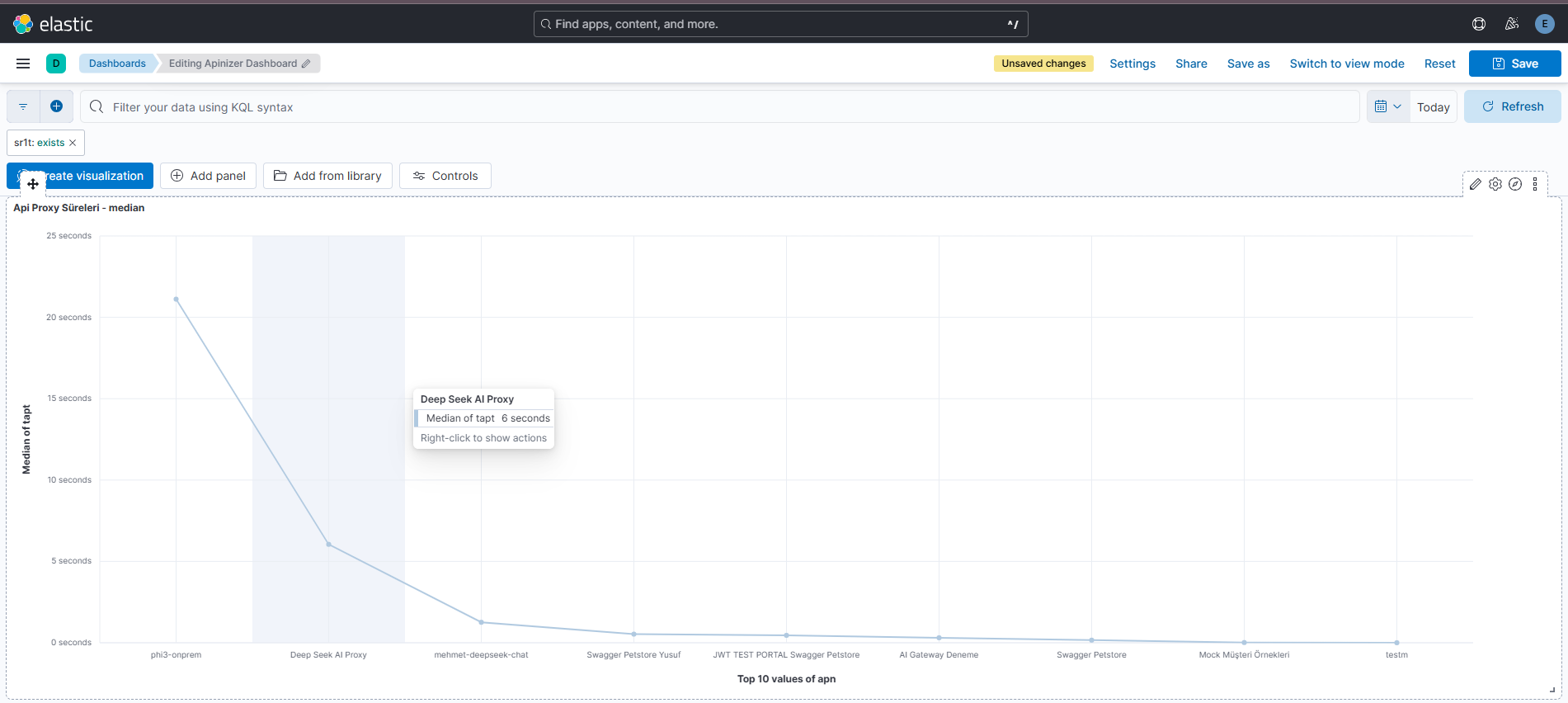
A Median on tapt (total API proxy time), broken down by the Top 10 values of apn, is shown as a line chart. Choosing Median instead of Max here is a deliberate counter-example: the previous two panels show the "worst-case scenario" (max), while this panel shows the "typical user experience" (median). A good performance dashboard should include both - relying only on the average can be misleading, just as looking only at the maximum can trigger unnecessary panic.
4.4 — Detail Tables: "Where do I look when I need the raw data?"
Some questions are better answered by an ordered list than by a chart. The final layer of the dashboard is deliberately built from Data Table panels:
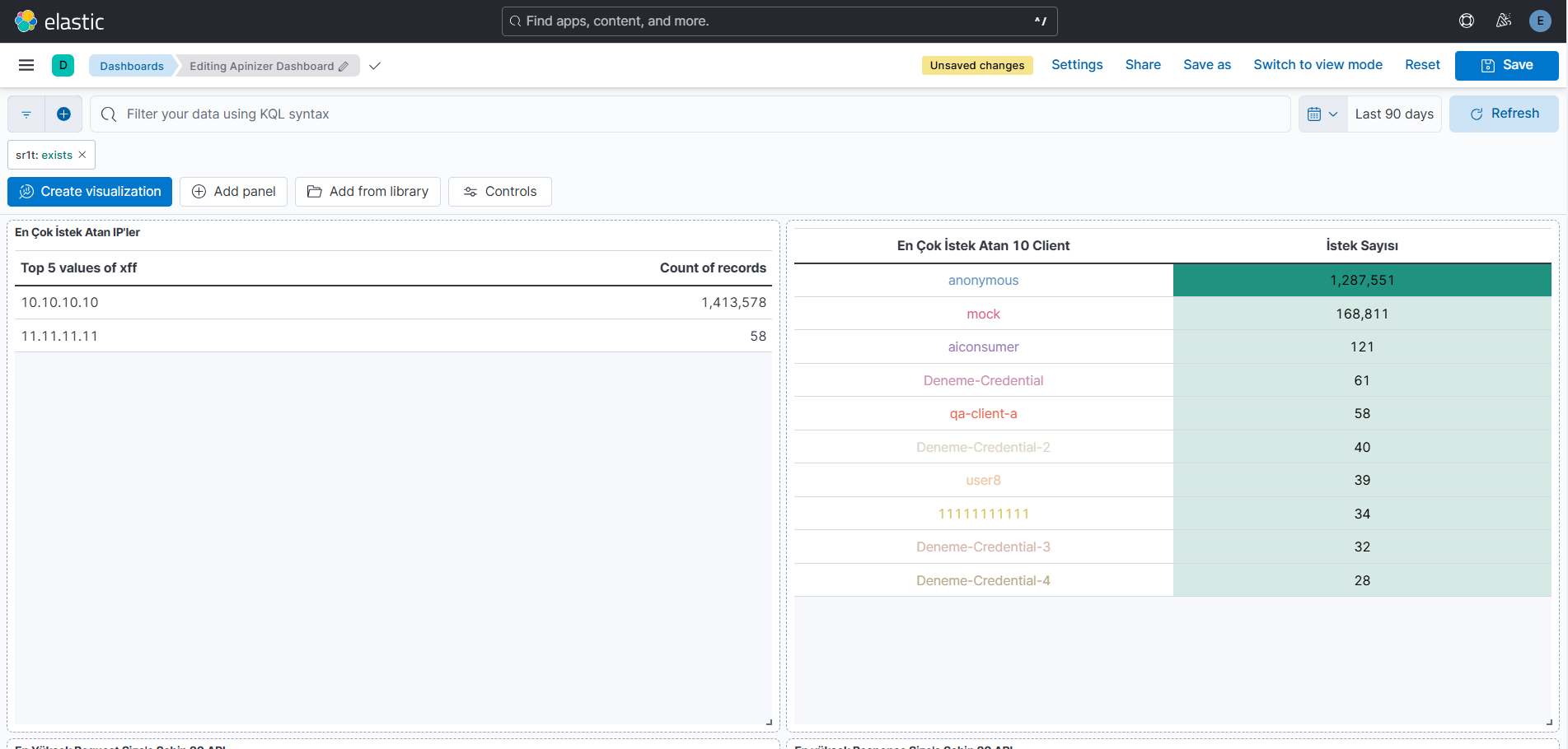
- Top IPs / Top Clients by Request Count — the
Top 5values of thexff(client IP) field withCount/ theTop 10values of theuok(client/consumer key) field
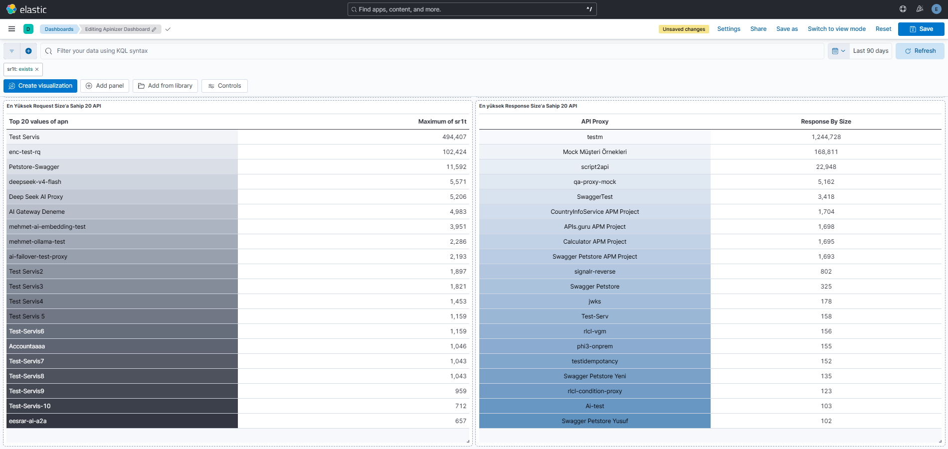
- Top 20 APIs by Request / Response Size —
apnTop 20+Maxonsr1t(request size) /sr2t(response size)
These panels exist to catch potential misuse (a client sending excessive requests, an integration sending abnormally large payloads). The reason a table was chosen instead of a chart is clear: the goal here isn't to see a trend, but to find a specific record - which IP, which API, which size - by name/value.
Conclusion
Thinking of Kibana not just as "the place where you look at logs," but as a cockpit where you keep a finger on your system's pulse, changes the essence of the work. Instead of randomly turning hundreds of fields into charts, first asking "what would actually prove to me that my system is running healthily?" is the real step that makes a dashboard meaningful. Once you've identified the right KPIs - Response Time, Error Rate, Throughput - the choice of chart naturally becomes clear too: tracking a change over time calls for a Line/Area Chart; comparing across categories calls for a Bar Chart; showing how a whole splits into parts calls for a Pie/Donut Chart.
Working through Kibana Lens, the Data View selection, chart type, and metric/bucket (Count, Average, Sum, Percentile, Terms, Date Histogram, etc.) configuration actually comes together in just a few steps.
To make this concrete, we also shared the real dashboard we built on top of Apinizer API Gateway logs. We structured this dashboard in four layers:
- General health summary — Metric/Pie panels that answer "good or bad" within the first 3 seconds
- Traffic analysis — time-series charts showing when an anomaly started
- Performance analysis — panels using Max and Median metrics to show both the worst-case scenario and the typical experience
- Detail tables — Data Tables for finding a specific record (which IP, which API, which size)
Ultimately, a good dashboard isn't measured by how many charts you can fit on the screen, but by its ability to answer the right question within seconds during a crisis.