Observing the Apinizer API Gateway with OpenTelemetry (Part 2): Three Grafana Dashboards — APM/RED, Collector Health, and Tempo Ops
This is the second part of a four-part series on the Apinizer API Gateway and OpenTelemetry. In this part we make the data produced by the infrastructure we built in Part 1 visible with three Grafana dashboards.
- OpenTelemetry Apinizer API Gateway integration: architecture, setup, verification
- Three Grafana dashboards: APM/RED, Collector Health, Tempo Ops (this part)
- SLI/SLO definitions: error budget and alerting
- Service graph: trace/metric/log correlation
Everything in this series takes the agent-based road. If you'd rather export straight from the product — no agent to install, and with AI token/cost telemetry built in — see the companion article, Native OpenTelemetry Export from the Apinizer API Gateway.
Where Did We Leave Off in Part 1?
At the end of Part 1 we had a working chain: the gateway was instrumented without code changes, every request's trace was flowing into Tempo, and metrics were being written to the central Prometheus through a Prometheus Agent. We verified the chain at four points; the data is flowing.
But let's return to the question that opened this series: when your API Gateway slows down, can you answer the question "where?" Classic monitoring tells you that a problem exists, not where it is. In Part 1 we collected the raw material for that answer; the trouble is, raw data does not speak for itself. We cannot form a picture of overall system health by opening traces in Tempo one by one, and the time series in Prometheus are just numbers sitting on a disk until someone queries them.
And there is one more blind spot: in Part 1 we made the traffic visible, but nobody was watching the system that does the watching. If the Collector's export queue fills up, we lose spans — and we only notice when we ask "why is there no trace for this request?". If Tempo's disk fills up, no new traces can be written. The observability stack is itself a system, and it too must be observed.
By the end of this part we will have four things:
A Rate/Errors/Duration summary of gateway traffic: per-proxy breakdown, latency percentiles, and error analysis down to status code classes.
The API proxy name and the Apinizer correlation ID on every span. "Which API is slow?" becomes answerable at the metric level.
The panel that watches the watcher: span flow, export queue, rejected data, memory. Silent data loss becomes visible.
The health of the trace store: ingester flushes, the blocklist, disk usage, and proof that retention actually works.
Before we start, let's recall the three metric families we inherited from Part 1:
| Metric family | Who produces it? | What does it tell you? |
|---|---|---|
apinizer_trace_* | spanmetrics connector | RED metrics derived from spans: request count, errors, duration histogram |
traces_service_graph_* | servicegraph connector | Service dependencies from CLIENT→SERVER span pairs |
apinizer_api_traffic_* | Gateway (native) | Business metrics: per-API traffic counters, cache and policy behavior |
All three are published on the Collector's :8889 port and have already reached the central Prometheus over the remote_write chain. This part focuses on the first two families; the apinizer_api_traffic_* business metrics produced natively by the gateway are outside the scope of this article — see the Prometheus and Grafana Integration guide for their setup and panels. Now let's make this data speak.
What Is RED, and Why RED?
RED is the three-metric monitoring model Tom Wilkie (Weaveworks) proposed for microservices: Rate, Errors, Duration. The model answers the question "what is the minimum number of questions that summarize the health of a service?"
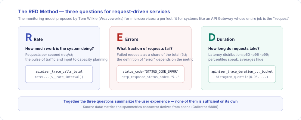
RED's strength is not its simplicity but its target audience: the model was designed for request-driven services, and an API Gateway is the very definition of a request-driven system. Everything a gateway does starts with a request and ends with a response, so these three questions cover the entire user experience at the gateway. Resource metrics like CPU and memory (the USE model) are valuable too — but your users never see CPU; they see slow responses and errors. RED measures exactly what the user sees.
Where Do These Metrics Actually Come From?
Before building dashboards, let's clear up a point that can confuse you while reading the panels.
apinizer_trace_* prefix is misleadingThese metrics do not come from the gateway. The apinizer_trace prefix in the name comes from the namespace: apinizer.trace setting we gave the spanmetrics connector in Part 1. The producer is the Collector itself: the spanmetrics connector looks at the gateway's spans and derives counters and histograms from them. The gateway is unaware these metrics exist.
The distinction matters because every panel on the dashboard has a different producer behind it, and when a panel goes blank, "where to look" depends on that producer:
| Metric | Who produces it? | Source | Published from |
|---|---|---|---|
apinizer_api_traffic_* | Gateway (application code) | Business logic counters | :9091 → Collector → :8889 |
apinizer_trace_* | Collector (spanmetrics connector) | Spans | :8889 |
traces_service_graph_* | Collector (servicegraph connector) | CLIENT→SERVER span pairs | :8889 |
jvm_*, http_client_* | OTel Java agent (OTLP metric signal) | JVM runtime | :8889 |
otelcol_* | The Collector's own internal telemetry | Collector internals | :8888 |
tempo_*, tempodb_* | Tempo | Trace store operations | :3200 |
The practical consequence: without apinizer_trace_* you cannot build a RED dashboard, because the request/error/duration data derived from spans lives there. The gateway's own counters, apinizer_api_traffic_*, carry business information that never appears on a span — cache hits, policy behavior; for the details of that family, see the integration guide linked above.
Carrying Business Context into Traces
This is the most valuable part of this article — and the part that is rarely explained properly anywhere. spanmetrics gives us request rate, error rate, and a duration histogram — great. But the moment we ask one question, we hit a wall: "which API proxy?"
The Problem: There Is No Proxy Identity on the Span
The OTel Java agent sees the gateway as an HTTP server: the span carries the method, the path, the status code. But "which Apinizer API proxy definition did this request hit?" is business context; the agent has no way of knowing it. Without a proxy identity we cannot break RED metrics down by proxy; all we have is the gateway's total traffic. The difference between "one of the APIs is throwing errors" and "the petstore proxy is throwing errors" is measured in hours during a midnight incident.
There is a second, sneakier problem: Kubernetes liveness/readiness probes also send HTTP requests to the gateway, and they produce SERVER spans too. spanmetrics does not separate them from API traffic. You may see 0.2 req/s on the panel and feel pleased — until you realize all of it is probes. A classic trap.
The First Approach: Reading the Proxy Name from a Header
The Collector manifest in Part 1 already contained a preparation for this job:
# From the Part 1 manifest: the idea of reading the proxy name from a response header
- set(attributes["apinizer.apiproxy.name"], attributes["http.response.header.x-apinizer-apiproxy-name"][0]) where attributes["http.response.header.x-apinizer-apiproxy-name"] != nil
The idea was to read the proxy name from the x-apinizer-apiproxy-name response header. While building the dashboards in this part and inspecting the raw spans in Tempo, we saw that two conditions would have to hold at the same time for this approach to work:
- The gateway would have to add the header to every response — which means interfering with the request/response flow purely for observability.
- Even if the header were sent, the agent would not see it on its own: the OTel Java agent does not write custom headers onto spans by default. Header capture must be requested explicitly through the corresponding environment variable.
This inspection also taught us an important behavior of the transform processor: when running with error_mode: ignore, a statement whose input is missing is silently skipped. It produces no error, no log, no warning; the attribute simply never comes into existence. In other words, a statement sitting in the manifest and a statement actually producing a value are not the same thing.
Before writing a transform statement, verify that the attribute it reads actually exists on the span by inspecting a raw span in Tempo. Under error_mode: ignore, a missing input does not produce an error; the statement simply does nothing.
Putting these two observations side by side made the decision clear: instead of waiting for the proxy name in a header — or touching the request flow just to put it there — derive it from data that is already present on every SERVER span.
The Path We Chose: Deriving the Proxy Name from url.path
That data is url.path. Apinizer's path structure looks like this:
/{api-gateway-root-context}/{project-path?}/{proxy-path}/{proxy-endpoint}
                            ^^^^^^^^^^^^^^^ optional → the segment count is NOT fixed
And here is the wrinkle: because {project-path} is optional, you cannot tell from the URL whether a project is present. In the request /apigateway/mirror/store/inventory, is mirror a project or a proxy? The path alone does not say. Faced with this ambiguity, we chose a compromise: we take the first two segments after the root context (/apigateway) as the proxy name:
| Incoming request | apinizer.apiproxy.name | Outcome |
|---|---|---|
/apigateway/apm-project/petstore-swagger/store/inventory | /apm-project/petstore-swagger | Exactly right for proxies under a project |
/apigateway/mirror/store/inventory | /mirror/store | The endpoint's first segment leaks into the name; but the value set stays bounded |
/metrics, probe requests | non-api | Non-API traffic collapses into a single label and can be filtered out of RED |
For proxies without a project, having the endpoint's first segment leak into the name is not ideal; but the alternative — using the full path as a label — means cardinality explosion. Every unique path would produce its own time series, and drowning Prometheus in those is a bigger problem than the one we are solving. Two segments is precisely the balance of "enough information to tell proxies apart, enough restraint not to blow up the series count".
We do not lose the full path either: it is stored as the span attribute apinizer.request.path — but it is not a dimension. It is used in TraceQL queries to drill down to a single request, never as a metric label.
On CLIENT spans, url.path carries the address of the backend the gateway is calling; deriving a proxy name from it gives wrong results. That is why the RED panels already filter on span_kind="SPAN_KIND_SERVER", and probe traffic can be separated via apinizer.apiproxy.name.
Correlation ID: Connecting a Trace to the Apinizer Record
The second piece of business context is Apinizer's own identifier. Apinizer stamps an APINIZER-CORRELATION-ID header on every response; the same value is kept in Apinizer's API traffic records. This ID is therefore the key that joins the record of the same request across three separate systems: the traffic record in Apinizer, the trace in Tempo, and the log in Elasticsearch.
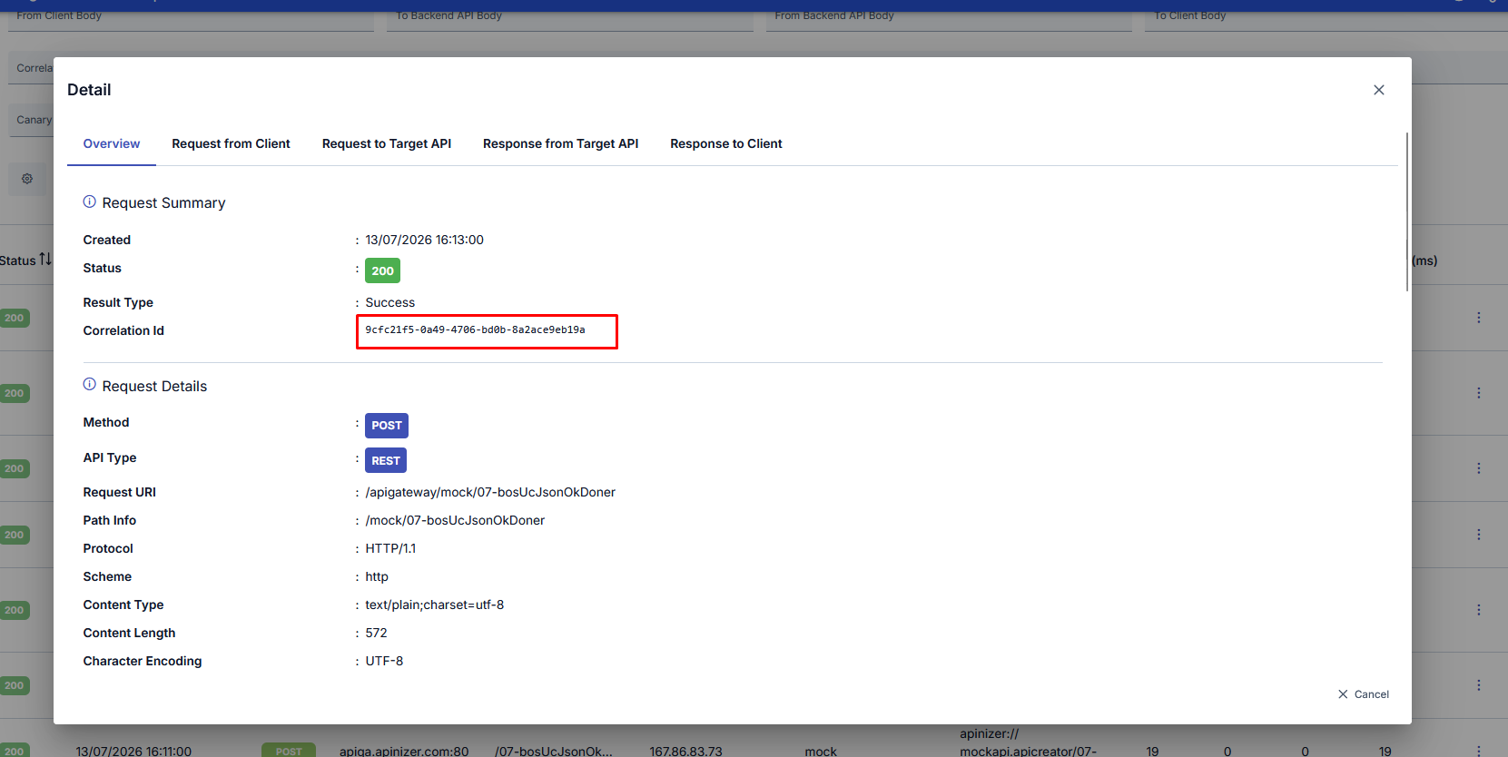
Here we apply what we learned while examining the header approach: first, we tell the agent to capture this header. A single environment variable is added to the Instrumentation CR:
# instrumentation.yaml — env added to the CR from Part 1
spec:
  env:
    - name: OTEL_LOGS_EXPORTER
      value: "none"
    - name: OTEL_INSTRUMENTATION_HTTP_SERVER_CAPTURE_RESPONSE_HEADERS
      value: "apinizer-correlation-id"
With this setting the agent writes the response header onto the span as the attribute http.response.header.apinizer-correlation-id. Now the transform has an input that actually exists, and it moves the value to a friendlier name:
# transform/apinizer-traces — the correlation ID chain (first match wins)
- set(attributes["apinizer.correlation_id"], attributes["http.response.header.apinizer-correlation-id"][0]) where attributes["http.response.header.apinizer-correlation-id"] != nil
- set(attributes["apinizer.correlation_id"], attributes["http.response.header.apinizer_correlation_id"][0]) where attributes["apinizer.correlation_id"] == nil and attributes["http.response.header.apinizer_correlation_id"] != nil
- set(attributes["apinizer.correlation_id"], attributes["http.request.header.apinizer-correlation-id"][0]) where attributes["apinizer.correlation_id"] == nil and attributes["http.request.header.apinizer-correlation-id"] != nil
Three statements try the three possible carriers of the same value in order (hyphenated response header → underscore variant → request header); the first non-empty one wins.
If you turn a value that is unique per request into a metric label, every request produces its own time series — the textbook definition of cardinality explosion. The correlation ID must remain a trace attribute only. You see the aggregate picture in metrics, and with the correlation ID you drill down to a single request via TraceQL:
{ .apinizer.correlation_id = "9cfc21f5-0a49-4706-bd0b-8a2ace9eb19a" }
We will show this query live in the section on jumping from a chart to a trace.
The Final Shape of the transform Pipeline
The sum of all these decisions is an 11-statement chain in the transform/apinizer-traces processor. Order matters, because later statements look at the results of earlier ones:
| Step | What does it do? | On which span? |
|---|---|---|
| 1–4 | CLIENT enrichment: the address being called (apinizer.routing.address), the target service (peer.service), and the span role — elasticsearch-logging if the target is Elasticsearch, otherwise upstream-routing | CLIENT |
| 5 | Store the full path as apinizer.request.path (for TraceQL; not a dimension) | SERVER |
| 6–8 | Derive apinizer.apiproxy.name: first two segments, then a single segment if that is all there is, otherwise non-api (in order, each step only if the previous one left it empty) | SERVER |
| 9–11 | The apinizer.correlation_id chain: response header (hyphen) → response header (underscore) → request header | SERVER |
Note the apinizer.span.role attribute in steps 1–4: this small label will carry the answer to the upcoming "where is the latency?" question. It splits the gateway's outgoing calls into routing to upstream and logging to Elasticsearch, so we will see on a single panel whether a slowdown comes from the backend or from the logging infrastructure.
transform/apinizer-traces (the new state of this block in collector.yaml)
# collector.yaml → the post-Part-2 state of the transform block under processors.
# The rest of the manifest is unchanged from Part 1; only this block changed.
transform/apinizer-traces:
  error_mode: ignore
  trace_statements:
    - context: span
      statements:
        # ---------- CLIENT spans: upstream / elasticsearch split ----------
        - >-
          set(attributes["apinizer.routing.address"], attributes["url.full"])
          where kind == SPAN_KIND_CLIENT and attributes["url.full"] != nil
        - >-
          set(attributes["peer.service"], attributes["server.address"])
          where kind == SPAN_KIND_CLIENT and attributes["server.address"] != nil
        - >-
          set(attributes["apinizer.span.role"], "elasticsearch-logging")
          where kind == SPAN_KIND_CLIENT and IsMatch(attributes["server.address"], ".*(elastic|9200).*")
        - >-
          set(attributes["apinizer.span.role"], "upstream-routing")
          where kind == SPAN_KIND_CLIENT and attributes["apinizer.span.role"] == nil

        # ---------- SERVER spans: proxy identity (from url.path) ----------
        - >-
          set(attributes["apinizer.request.path"], attributes["url.path"])
          where attributes["url.path"] != nil
        # with AND without a project: /apigateway/{a}/{b} → "/a/b"
        - >-
          set(attributes["apinizer.apiproxy.name"],
          Concat(["/", Split(attributes["url.path"], "/")[2], "/", Split(attributes["url.path"], "/")[3]], ""))
          where attributes["url.path"] != nil and IsMatch(attributes["url.path"], "^/apigateway/[^/]+/[^/]+(/.*)?$")
        # single segment: /apigateway/{a} → "/a"
        - >-
          set(attributes["apinizer.apiproxy.name"],
          Concat(["/", Split(attributes["url.path"], "/")[2]], ""))
          where attributes["apinizer.apiproxy.name"] == nil and attributes["url.path"] != nil and IsMatch(attributes["url.path"], "^/apigateway/[^/]+/?$")
        # non-API (metrics, probes): non-api
        - >-
          set(attributes["apinizer.apiproxy.name"], "non-api")
          where attributes["apinizer.apiproxy.name"] == nil and kind == SPAN_KIND_SERVER

        # ---------- Correlation ID (response hyphen → response underscore → request hyphen) ----------
        - >-
          set(attributes["apinizer.correlation_id"], attributes["http.response.header.apinizer-correlation-id"][0])
          where attributes["http.response.header.apinizer-correlation-id"] != nil
        - >-
          set(attributes["apinizer.correlation_id"], attributes["http.response.header.apinizer_correlation_id"][0])
          where attributes["apinizer.correlation_id"] == nil and attributes["http.response.header.apinizer_correlation_id"] != nil
        - >-
          set(attributes["apinizer.correlation_id"], attributes["http.request.header.apinizer-correlation-id"][0])
          where attributes["apinizer.correlation_id"] == nil and attributes["http.request.header.apinizer-correlation-id"] != nil
The Final spanmetrics Dimension List
Which attributes become metric labels (dimensions) is the most deliberate design decision in this part. The final list:
spanmetrics:
  dimensions:
    - name: apinizer.apiproxy.name
      default: unknown
    - name: k8s.namespace.name
    - name: apinizer.span.role
    - name: server.address
    - name: peer.service
    - name: http.request.method
    - name: http.response.status_code
      default: "0"
There are two deliberate omissions: apinizer.request.path and apinizer.correlation_id. Both carry high cardinality; they live on the trace as span attributes but never become metric labels. And there are two deliberate defaults: unknown when the proxy name cannot be derived, and "0" when no HTTP status code ever came into existence. That "0" is not an innocent placeholder — it will play a leading role in the error analysis; we will see it shortly.
What Changed in collector.yaml?
Part 1 was the installation; this part is that installation's extension. So we are not reprinting the whole manifest; here is the rundown of what changed relative to Part 1's otel-collector.yaml:
Added:
- The
transform/apinizer-tracesblock grew into the 11-statement shape above: the three statements deriving the proxy name fromurl.pathand theapinizer.request.pathstatement storing the full path are new. k8s.namespace.nameandhttp.response.status_code(with a default of"0") were added to the spanmetrics dimension list;apinizer.apiproxy.namenow comes withdefault: unknown.- The
OTEL_INSTRUMENTATION_HTTP_SERVER_CAPTURE_RESPONSE_HEADERSenvironment variable was added to the Instrumentation CR (we saw it in the correlation ID section).
Removed:
- The statement reading the proxy name from the
x-apinizer-apiproxy-nameheader was removed; its input never materialized, and theurl.pathsolution made it redundant. - The
apinizer.apiproxy.pathstatement was removed; the same information is already kept inapinizer.request.path. - The correlation ID chain was reordered: it was reduced to three statements that try the hyphenated response header first, then the underscore variant, and the request header last.
The Dashboard: APM/RED
The data is ready and the business context is in place; now let's bring it all together in a single dashboard. The dashboard we built is a single JSON file: its uid is apinizer-otel-apm-red, and it has two variables. cluster selects which environment you are looking at, and apiproxy lets you narrow the RED panels down to a single proxy. The dashboard has six rows, and from top to bottom they descend from "what is the user experiencing?" to "how is the infrastructure doing?":
| Row | What does it tell you? |
|---|---|
| RED Summary | Request rate, error analysis, and latency percentiles; the heart of the dashboard |
| Where Is the Latency? | Splits latency by span role: the backend, the logging infrastructure, or the gateway itself? |
| API Proxy Breakdown | The 10 slowest proxies, per-proxy error rates, and upstream dependencies |
| Gateway JVM | The heap and GC panels the OTel agent brings in at no extra cost |
| Collector Health | The health of the observability stack itself: span flow, queue, memory |
| Tempo Ops | The operational state of the trace store: flushes, disk, retention |
The dashboard is being prepared for publication in the Grafana Labs library; once it is approved, the official link will be added here. When it is published, you will be able to import it in Grafana from the Dashboards page via New → Import, selecting your Prometheus data source.
Before moving on to the panels, let's look at the common pattern every RED query shares; understand it once and every query on the dashboard becomes readable:
apinizer_trace_calls_total{
  span_kind="SPAN_KIND_SERVER",
  apinizer_apiproxy_name=~"$apiproxy",
  apinizer_apiproxy_name!=""
}
Each of the three filters has a job:
span_kind="SPAN_KIND_SERVER": counts only the requests arriving at the gateway. Without this filter, the CLIENT calls the gateway makes to the backends would leak into the count and every request would show up twice.apinizer_apiproxy_name=~"$apiproxy": binds to the dashboard variable; this is what narrows the panels down to a single proxy.apinizer_apiproxy_name!="": keeps out old spans on which the attribute never existed. Probe traffic stays separate under thenon-apilabel; by removingnon-apifrom the variable selection you can reduce the RED panels to pure API traffic.
One spelling detail: in Part 1 we named attributes with dots (apinizer.apiproxy.name), but in Prometheus labels the dots become underscores (apinizer_apiproxy_name). You need to remember this conversion when writing queries.
On top of this pattern, the Rate panel is a single line:
sum(rate(apinizer_trace_calls_total{span_kind="SPAN_KIND_SERVER", apinizer_apiproxy_name=~"$apiproxy", apinizer_apiproxy_name!=""}[$__rate_interval]))
The Duration panels calculate percentiles from the histogram buckets with the same filters; p50, p95, and p99 share one chart:
histogram_quantile(0.95, sum by (le) (rate(apinizer_trace_duration_milliseconds_bucket{span_kind="SPAN_KIND_SERVER", apinizer_apiproxy_name=~"$apiproxy", apinizer_apiproxy_name!=""}[$__rate_interval])))
When publishing on :8889, the Collector normalizes some metric names; for example, the counter that appears as apinizer_api_traffic_total_count_total on the gateway's own endpoint becomes apinizer_api_traffic_count_total in the Collector's output. The reason is that the prometheus receiver strips suffixes like _total and the exporter adds them back; this round trip is lossy for some names. When writing a panel query, verify the metric name against the Collector's :8889 output, not the application's endpoint.
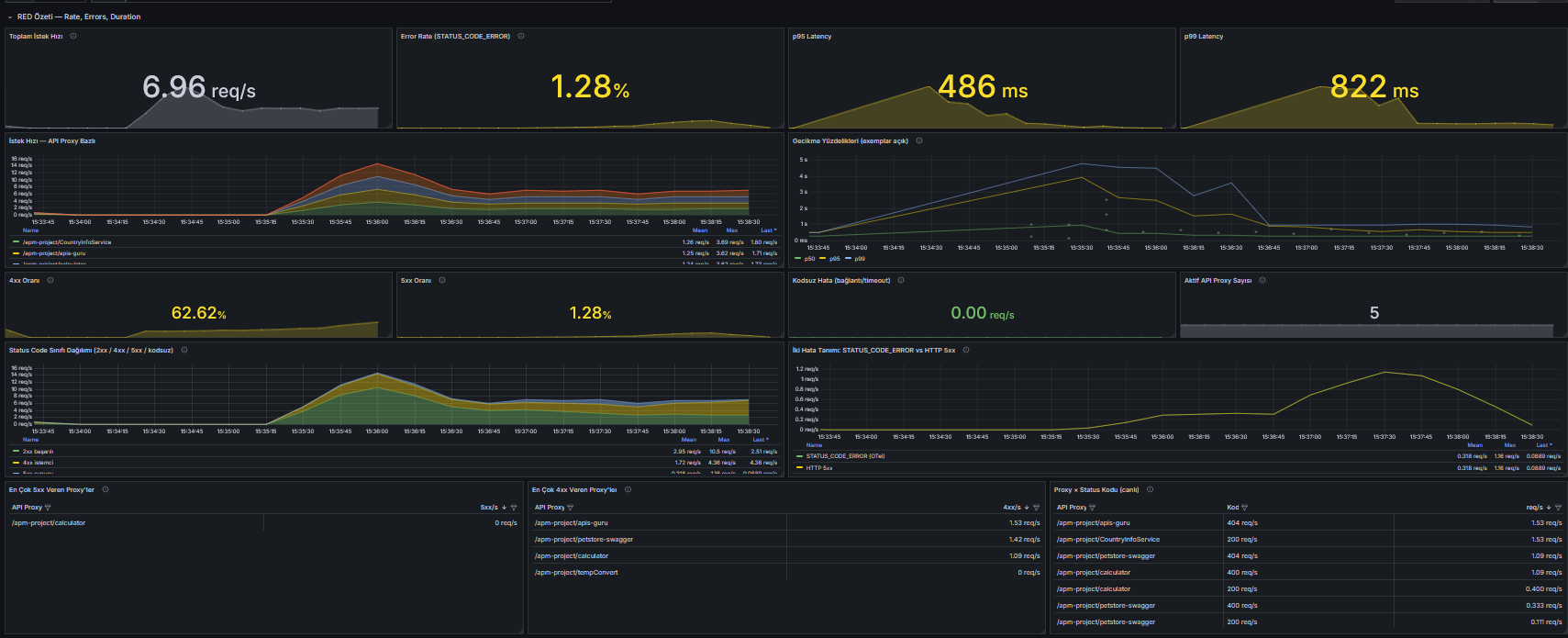
Let's note that the screenshots in this part are backed by real data, not empty panels: to fill the panels we used JMeter to send roughly 100 threads of traffic for 300 seconds — a mix of successful and deliberately failing requests — to four different API proxies defined on the gateway; the dashboards were tested under this realistic traffic. Under that traffic, the RED summary looks like this:
Going Deeper on Error Rate: Two Definitions of Error
"What is your error rate?" sounds like a question with a single-number answer; it is not. On this dashboard, error analysis starts with four separate stat panels: the STATUS_CODE_ERROR rate, the 5xx rate, the 4xx rate, and the codeless error rate. The four stand apart because each answers a different question.
The first distinction comes from OTel's own definition of error. According to the OTel semantic conventions, 4xx responses do not make a SERVER span erroneous; a client's mistake does not count as a server failure. The status_code="STATUS_CODE_ERROR" label therefore covers 5xx responses, exceptions, and timeouts — but not 4xx. In other words, OTel's error rate and the HTTP 5xx rate are not the same thing, and the panel tracks them separately:
sum(rate(apinizer_trace_calls_total{span_kind="SPAN_KIND_SERVER", apinizer_apiproxy_name=~"$apiproxy", apinizer_apiproxy_name!="", status_code="STATUS_CODE_ERROR"}[$__rate_interval]))
There is a practical reason to track 4xx separately: a login endpoint can return 401 all day long, and that is not an outage. If you lump 4xx together with 5xx under the same "error %", client-side noise drowns out real failures. The reverse also holds: a sudden spike in 4xx is the first sign of a client integration breaking while the backend is perfectly healthy. A separate panel keeps both signals clean.
The fourth stat is the most valuable panel in this section: the codeless error. In the spanmetrics dimension list we set default: "0" for http.response.status_code; this is where that decision pays off. Requests that end without an HTTP status code ever coming into existence (dropped connections, timeouts, requests cut off before a response is written) are counted under status_code="0":
sum(rate(apinizer_trace_calls_total{span_kind="SPAN_KIND_SERVER", apinizer_apiproxy_name=~"$apiproxy", apinizer_apiproxy_name!="", http_response_status_code="0"}[$__rate_interval]))
These requests never show up in the 5xx counters; an alert that watches only 5xx is completely blind to this class. The sneakiest failures usually accumulate here.
Below the stat panels, two charts visualize these definitions. The status code class distribution splits traffic into 2xx/3xx/4xx/5xx/codeless bands and stacks them; the deliberate 404 and 400 requests in the test traffic separate cleanly into these bands. The two-definitions chart puts the STATUS_CODE_ERROR, HTTP 5xx, and codeless series on the same axis; the distance between the three lines is the visual answer to "which error definition should we alert on?"
At the end of the row, three tables bring the error analysis down to the proxy level: the proxies producing the most 5xx, the proxies producing the most 4xx, and a live pairing of proxy and status code. These tables are what turn "there are errors in the system" into "500s are rising on the petstore proxy".
When we get to SLI/SLO definitions, we will build the error budget on top of this distinction: the definition that consumes the budget is usually 5xx plus STATUS_CODE_ERROR, while 4xx is kept outside as a separate quality signal.
Answering "Where?": Breakdown by Span Role
We are back at the series' opening question: when the gateway slows down, where is the slowness? The apinizer.span.role label we wrote onto every CLIENT span in the transform pipeline existed for exactly this moment. Every outgoing call the gateway makes was split into one of two roles: upstream-routing toward the backend and elasticsearch-logging toward the logging infrastructure. The panel breaks p95 latency down by that role:
histogram_quantile(0.95, sum by (le, apinizer_span_role) (rate(apinizer_trace_duration_milliseconds_bucket{span_kind="SPAN_KIND_CLIENT"}[$__rate_interval])))
Reading it is simple: if the upstream-routing line climbs, the slowness is in the backend; if the elasticsearch-logging line climbs, it is in the logging infrastructure. If both lines stay calm while user latency rises, the gap points at the gateway's own processing time.
The second panel in the row approximates that gap: subtracting the average duration of the upstream CLIENT spans from the average duration of the SERVER spans leaves roughly the gateway pipeline's share. The word "approximate" in the panel's title is not decoration: the calculation runs on averages, and because the logging calls are asynchronous the durations do not add up exactly. Read this panel as a trend indicator, not a precise measurement; the change of the value over time carries more information than the value itself.
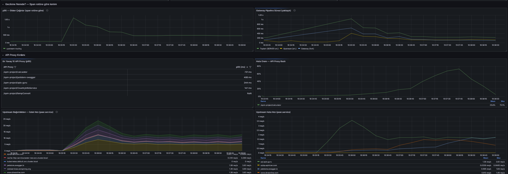
The value of these two panels shows in the midnight scenario. A user says "the API is slow"; the RED summary confirms p95 is climbing; and this row says the climb is coming from the backend. In a three-panel glance the suspect has been narrowed down, and reflex interventions like restarting the gateway are shown to be unnecessary. In fact, the screenshot above shows the real thing: the public backends we targeted with the test traffic naturally slowed down under the rising request rate; on the panel the upstream-routing line climbed while elasticsearch-logging stayed calm. We could state that the source of the slowness was the backends themselves — not the gateway — by looking at a panel, without opening a single trace.
Collector Health: Who Watches the Watcher?
We have arrived at the blind spot from the beginning of this part: the observability stack is itself a system, and it can fail. When the Collector fails, what you get is not an alarm but silence; spans disappear, panels go blank, and you only notice while hunting for a trace. This row exists to turn that silence into sound.
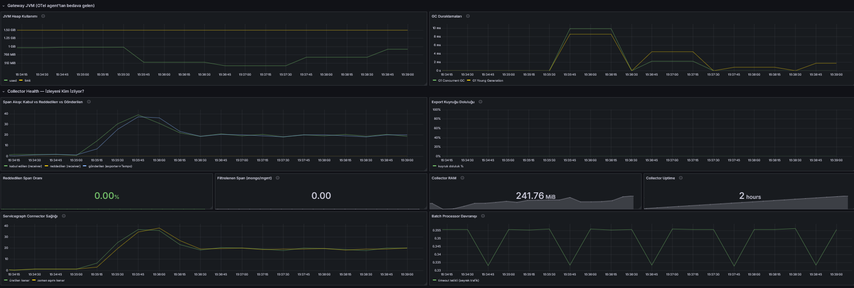
The raw material is the Collector's own internal telemetry: the otelcol_* metrics, published on port :8888 as you may recall from the table in Part 1. The row's eight panels answer these questions:
| Panel | Question it answers | Healthy look |
|---|---|---|
| Span flow | Are the accepted, refused, and sent-to-Tempo span rates in balance? | Accepted and sent lines on top of each other, refusals at zero |
| Export queue fill | Are we failing to keep up with Tempo? | Near zero; a filling queue is the early warning of span loss |
| Refused span rate | Is the Collector turning data away at the door? | Zero; if the memory_limiter kicks in, it shows here |
| Filtered spans | Is the MongoDB/management filter from Part 1 working? | A steady rate; proof the filter is alive |
| Collector RAM | How close are we to the memory_limiter ceiling? | Flat, clearly below the limit |
| Uptime | Did the Collector silently restart? | An uninterrupted climb; a reset means a restart |
| Servicegraph health | Are CLIENT and SERVER spans being paired? | Edges flowing, unmatched and expired counts low |
| Batch behavior | Are spans being packed efficiently? | Batch size fluctuates below the 1024 limit we configured |
The most important reading in this table is on the first line: the gap between accepted and sent. The two lines normally travel on top of each other; when they separate, spans are either piling up inside the Collector (the queue is filling) or being lost. During a Tempo restart, for example, you can count how many spans you lost over the outage by watching these two lines; that is exactly what watching the watcher means.
The servicegraph panel, meanwhile, is already laying the foundation for Part 4: the service graph is born from the pairing of CLIENT and SERVER spans. If the unmatched-span and expired-edge counts are rising, the connector cannot catch the pairs within its waiting window, and the store.ttl setting needs to be increased.
Two practical notes: the error counters in this row can show "No data" on a healthy system. In Prometheus, a counter is born on its first event; if no span was ever refused, the refusal series simply does not exist yet. A blank panel here is usually good news, not bad. Second, depending on the Collector version, the internal telemetry metrics may be published without the _total suffix; the dashboard uses the suffixed names, so if panels are unexpectedly blank, check whether the names on the :8888 output include _total.
Right above the Collector Health row sits one more small, two-panel row: Gateway JVM. Heap usage and GC pauses are data the OTel Java agent brings in at no extra cost through the OTLP metric signal. A memory leak or a GC storm on the gateway side can be the root of a latency rise on the RED panels; having the two rows side by side lets you make that connection at a glance.
Tempo Ops: The Health of the Trace Store
The last link in the chain is the trace store. If Tempo fills up or its flushes start failing, traces start disappearing even while the Collector looks perfectly healthy. This row's metrics come from Tempo itself: the tempo_* and tempodb_* families, on port :3200.
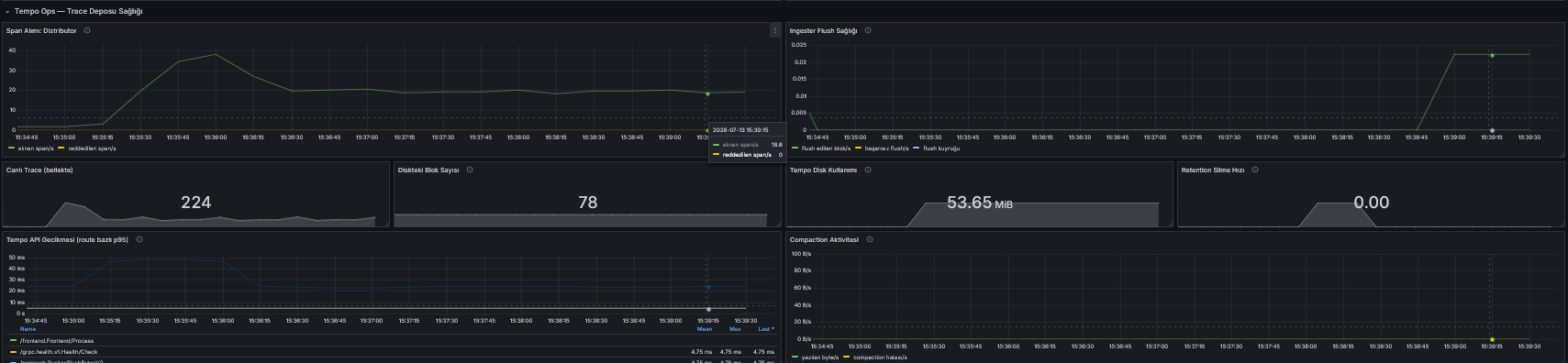
The easiest way to read the row is to follow a span's journey through Tempo. A span first reaches the distributor, is held in the ingester's memory as a live trace, is flushed to disk as a block, blocks are merged by compaction, and they are deleted when the retention period expires. Eight panels place a sentry at every stop of that journey:
| Panel | Stop on the journey | What to watch |
|---|---|---|
| Distributor ingest | The gate | Should match the rate the Collector sends; an end-to-end consistency check |
| Ingester flush health | Memory to disk | Failed flushes must stay at zero, the flush queue must not grow |
| Live traces | Memory | Proportional to traffic; continuous growth means memory pressure |
| Blocks on disk | The store | Should plateau once the retention period is reached |
| Disk usage | The store | Watched against the 5Gi PV limit from Part 1 |
| Retention delete rate | The exit | If deletions are flowing, retention is alive |
| Compaction activity | Maintenance | Should run regularly; if it stops, the block count balloons |
| API latency | The query side | If opening a trace in Grafana is slow, the culprit is sometimes Tempo itself |
The critical pair here is the block count and retention. In Part 1 we gave Tempo 48 hours of retention and 5Gi of disk; if the system works as designed, the block count grows for the first 48 hours, then new block production balances retention deletion and the line plateaus. If you see uninterrupted growth instead of a plateau, retention is not working and a full disk is a matter of time. A full disk in the trace store is a silent failure: Tempo stops accepting new traces, the Collector's export queue swells, and the chain clogs backwards; the queue panel one row up and this row's disk panel are two ends of the same story.
The failed-flush counter belongs to the same family: the moment it leaves zero, the traces in the ingester's memory can no longer reach the disk. There is no "it happens occasionally" level for this counter; it must be zero, and if it is not, look at the disk and the storage layer.
All three dashboard row families are now standing: RED tells you what the user is experiencing, Collector Health the health of the observability chain, Tempo Ops the health of the store. Next up are the bridges that take us from the aggregate picture down to a single request.
From Chart to Trace: Exemplars and the Correlation ID
Dashboards tell the aggregate story: the rate went up, p95 climbed, 5xx appeared. But at some point in every operation the question lands in the same place: "what happened in this one request?" We have two bridges from a metric down to a single request — and we deliberately built both into this setup.
The first bridge is the exemplar. In Part 1 we enabled exemplars: enabled: true on the spanmetrics connector; thanks to that setting, the trace IDs of real requests that fall into a histogram bucket are attached to that bucket. On the latency percentile panel in Grafana this appears as dots scattered around the lines: every dot is a real request, and clicking one takes you straight to the trace in Tempo. "Which request is dragging p99 up?" is thereby answered from the chart in a single click.
It helps to know one quirk of exemplars: for them to appear, five links of a chain must work at the same time. spanmetrics must produce the exemplar, the Collector's prometheus exporter must publish in the OpenMetrics format (enable_open_metrics: true from Part 1 is for this), Prometheus must have exemplar storage enabled, the Grafana data source must have exemplar queries turned on, and the panel must display them. If one link is missing there is no error message; the dots simply do not appear. If your panel shows no exemplars, check these five links in order.
The second bridge is the correlation ID we have been carrying since Part 1. The real-life scenario goes like this: a consumer reports "my request at such-and-such time got an error", and the request's Correlation Id is right there in Apinizer's traffic record. Because the same value now lives on every span as the apinizer.correlation_id attribute, a one-line TraceQL query against the Tempo data source in Grafana Explore is enough:
{ .apinizer.correlation_id = "9cfc21f5-0a49-4706-bd0b-8a2ace9eb19a" }
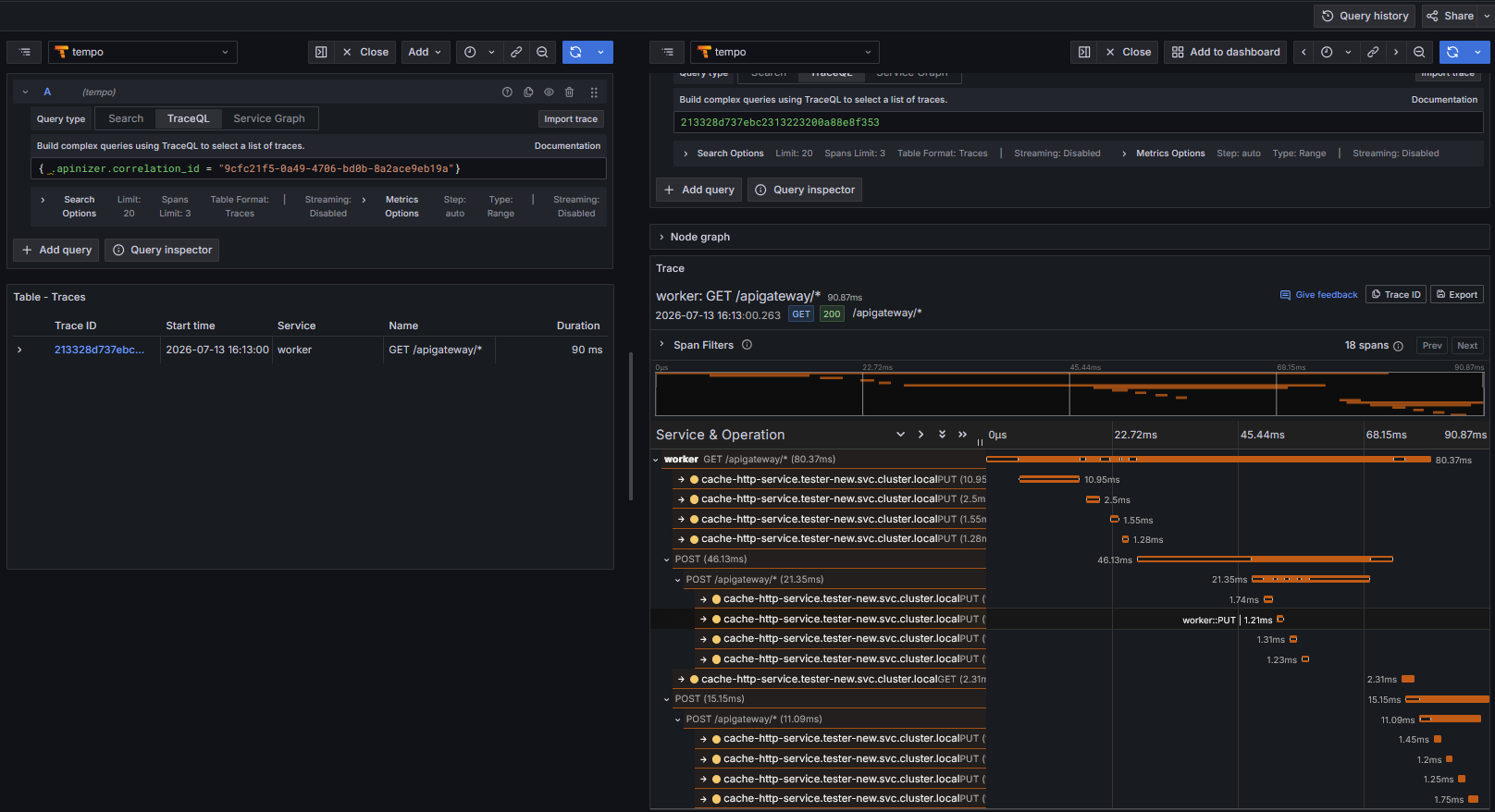
The query's result is that request's end-to-end story: entry into the gateway, policy processing, the backend call, logging. The record in Apinizer answers "what was returned?", and the trace in Tempo answers "why, and where?". In Part 4 we will add the Elasticsearch log to this triangle and complete the trace/metric/log correlation.
Problems We Hit Along the Way
Some of what we learned in this part comes not from configuration lines but from how OTel works. The five behaviors below are not specific to our environment; they will confront anyone who builds this chain, and none of them announces itself with an error message:
- A component not wired into a pipeline does not run — and does not warn. A receiver, processor, or connector may be defined in the config; if it is not referenced under
service.pipelines, it never runs and writes not a single line to the log. That is why, on the Collector Health panel, a component's series never appearing and a component's series showing zero are different things; the former is a sign the component is being ignored. - transform skips a statement whose input is missing. Under
error_mode: ignore, a missing input produces no error; the statement simply does not run. We saw this first-hand in the header section; the rule stands: verify that the attribute a transform reads exists on a raw span first. - Kubernetes probes produce SERVER spans too. Liveness and readiness requests enter spanmetrics through the same door as API traffic. Without the business context label they would have polluted the RED panels; that is what the
non-apilabel is for. If you see low but steady traffic on a panel, first ask whether it is probes. - On a SERVER span, 4xx is not an error. This is a deliberate decision in OTel's semantics; "your error rate" depends on which metric you are looking at. Keeping the two error definitions on separate panels exists precisely to make this behavior visible.
- A SOAP fault may not be visible at the HTTP layer. A fault can come back in a 200 body, and no panel that looks at HTTP codes can catch it. In SOAP-heavy environments the error definition must be supplemented with business metrics.
Wrapping Up
At the end of Part 1, data was flowing but not speaking. At the end of this part, here is what we have:
- Business context on every span: the API proxy name is derived from
url.path, and the Apinizer correlation ID is captured from the response header. We did this without touching gateway code — with Collector configuration alone. - Error is not a single number: OTel's error definition, HTTP 5xx, separately tracked 4xx, and the codeless errors that catch the sneakiest failures now live on separate panels.
- Three panel families are on duty: RED tells you what the user experiences, Collector Health the health of the observability chain, Tempo Ops the state of the trace store.
- Two bridges from a chart down to a single request are working: exemplars and the correlation ID.
- And the panels were tested not with mock data but under realistic JMeter-generated traffic mixing successful and failing requests.
Back to the question that opened the series: when the API Gateway slows down, the answer to "where?" is now on a panel. But something is still missing: someone has to be looking at these panels. If latency climbs at 3:00 AM, we do not want to find out in the morning; the panel itself should tell us. That is exactly what we will build in Part 3: SLI definitions, SLO targets, error budgets, and the alert rules that teach the panels when to speak up.
Part 1: OpenTelemetry Apinizer API Gateway integration is live. Part 3 (SLI/SLO and alerting) and Part 4 (the service graph and trace/metric/log correlation) are on the way.