Traffic by Interval
Since an API Proxy can be loaded into multiple environments, metrics must also be evaluated according to the environment it is loaded into. Therefore, in all analytics screens, metrics are filtered by first selecting environment information.
Metric data cannot be displayed for environments where Elasticsearch integration is not configured. In this case, a warning message is displayed on the screen.
For regular HTTP API Proxies, the traffic of a request is tracked across three separate measurement regions: request pipeline, routing, and response pipeline. WebSocket and gRPC connections do not go through these three phases; since they are continuous, bidirectional streams, they are only tracked as data coming into Apinizer and data going out of Apinizer. Because of this, these API Proxy types have only 2 measurement regions.
Metrics Page
This report is the Traffic Trend tab of the Metrics page (full name: API Traffic By Interval). Open it via Administration > Reports > Metrics or Reports > Metrics in the project menu.
Filtering
The filter row at the top of the Metrics page is shared across all tabs and sub-reports:
| Filter | Description |
|---|---|
| Environment | Selects the environment whose traffic you want to view. |
| Project | (Admin menu only) Filters traffic by one or more selected projects. |
| Date Range | Determines the time span over which traffic is collected. The default value is the last 1 hour. |
| Refresh | Reloads the currently displayed sub-report with the current filter values. |
| Excel Export | Export on the shared filter row; downloads data for the active sub-report. |
Report-specific Controls
Controls specific to this report sit on the row below the tabs and are only visible while the Traffic Trend tab is selected:
| Control | Description |
|---|---|
| API Proxy | Narrows the report to specific API Proxies. Leave it empty to include every proxy. The option list is loaded according to the project selection in the filter row. |
| Interval | Determines the time buckets the traffic is grouped into. The report is re-queried as soon as you pick a value; you do not need to press Refresh as well. |
| Break down by | Splits the time series into one series per dimension value: API Proxy, HTTP Method, Consumer (username), API Client, Consumer / Application, or Organization. The default, None (system-wide), produces a single series covering all traffic. |
| Value unit | Selects whether values are shown as Request Count (the raw number in each bucket) or as TPS (requests/second). The default is Request Count. |
| Graph / List | Selects whether the same data is shown as a chart or as a table. Switching the view does not trigger a new query. |
Selectable interval values: Secondly, Minutely, Hourly, Daily, Weekly, Monthly, Quarterly, Annually. The default is Hourly.
A wide date range combined with a short interval can produce more time buckets than Elasticsearch will return in a single query. In most cases this is handled for you: before the query runs, the interval is automatically widened to one that fits, and a note under the interval selector explains why it changed ("Interval was widened automatically: ..."). The one case this does not cover is the Secondly interval with no breakdown selected — it is never auto-widened — so if the date range is still too wide for it, the report is rejected outright with a message asking you to narrow the date range, instead of silently returning an empty result.
Breaking Traffic Down by Dimension
When you pick a dimension other than None, the report draws one line per dimension value instead of the stacked success/blocked/error bars, so that dimensions can be compared against each other over time. The Dimension column also appears in the table view and in the Excel export.
Only the 20 busiest values are listed. Traffic outside those values is not shown as a separate series; the screen states this limit next to the selector.
API Proxies are grouped by their stable internal identifier and labelled with their name, so renaming a proxy does not split its history into two separate series.
The API Client, Consumer / Application, and Organization dimensions group traffic by the identity that authenticated the request. API Client groups by the API Client that was used to authenticate. Consumer / Application groups by the owner of that API Client, labelling each series with the Consumer's username or the Portal Application's name; requests authenticated with an older credential are also grouped here as a Consumer. Organization groups by the organization the authenticated identity belongs to.
These three dimensions rely on traffic data captured after this upgrade, so their series are empty for traffic recorded earlier. Requests that could not be authenticated are not included in any of these three breakdowns. If a Consumer, Application, or Organization behind an older series has since been deleted, its label falls back to the identifier.
Request Count vs TPS
The same "1200 requests" figure means 20 TPS in a minutely bucket and 0.33 TPS in an hourly one. Selecting TPS normalises every bucket to requests per second, which makes buckets of different lengths comparable and is what capacity planning needs.
TPS is calculated using each bucket's actual duration rather than a fixed divisor. This matters for calendar-based intervals: a daylight-saving transition day is 23 or 25 hours long, and months are 28-31 days long. With a fixed divisor a February figure would be off by roughly 7%.
Peak Windows
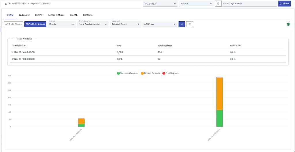
Above the chart, the Peak Windows panel lists the busiest time windows found in the current query, ordered from the highest rate down. It answers "when did we peak, and how hard?" without having to read the peaks off the chart by eye.
The panel is driven by the same query as the chart, so the two always agree. Each row covers one interval-length window:
| Column | Description |
|---|---|
| Dimension | (Only when a breakdown is active) The dimension value the window belongs to. |
| Window Start | The start of the peak window. Its length is the report's interval. |
| TPS | Requests per second within that window. |
| Total Request | Total number of requests in the window. |
| Error Rate | Share of the window's requests that ended in error. |
Rows are ranked by TPS rather than by raw request count, because only a rate makes windows of different lengths comparable.
When a breakdown is active, the peaks are taken per dimension and then ordered together. A low-volume API Proxy therefore still appears with its own busiest window instead of being crowded out by a high-volume one.
Windows with no traffic are never listed as peaks.
Views: Graph and List
The report's data can be presented in two different forms.
Graph View
As shown in the screenshot above, three colored bars are displayed for each time interval:
- Green — Successful requests
- Orange — Blocked requests
- Red — Error requests
The X axis shows the start of the time interval, and the Y axis shows the number of requests in that interval.
List (Table) View
Switch to the list icon on the sub-report row to show the same data as a table where each row represents one time interval. Chart and list views share the same filters (interval, breakdown, unit, peak windows).
Table Column Descriptions
| Column | Description |
|---|---|
| Interval Start Time | The start time of the time interval the traffic belongs to. |
| Success Request | Number of requests that completed successfully in this interval. |
| Blocked Request | Number of requests blocked in this interval, e.g. due to security policies or rate limiting. |
| Error Request | Number of requests that resulted in an error in this interval. |
| Total Request | Total number of requests in this interval (Success + Blocked + Error). |
| Dimension | (Only when a breakdown is active) The dimension value the row belongs to. |
| TPS | (Only when the TPS unit is selected) Requests per second in this interval. |