Visualizing API Traffic Metrics with Grafana
Apinizer Gateway exposes metrics for API traffic, processing times, and error rates to Prometheus. These metrics are monitored in Grafana as panels.
Grafana does not read API traffic logs stored in Elasticsearch. The data source is the time-series metrics collected from the Gateway's Prometheus endpoint. For individual request records, status codes, or request bodies, use Kibana.
The charts on this page are not backed by Elasticsearch API traffic logs. Grafana uses Apinizer Gateway metrics from Prometheus. The metrics endpoint uses port 9091 by default; if the port was customized, Prometheus and Grafana must be configured to use the customized port.
Installation
Grafana installation, Prometheus scraping, and the Prometheus data source definition in Grafana are covered in the documents below. Complete these steps before creating the sample charts.
Collecting Gateway metrics with Prometheus
Grafana setup and adding Prometheus as a data source
Available API traffic metrics and labels
Overview of Gateway and Cache metrics integration
After the Prometheus data source is added, create a panel in Grafana from Dashboards → New → Add visualization. Queries are written in PromQL.
Sample Charts
The panels below provide a view similar to the summary metrics on the Apinizer Overview screen. The queries use the apinizer_api_traffic_* metric family in Prometheus.
Request volume: total, successful, and failed requests
This panel splits API request rate (req/s) into total, successful, and failed requests. Traffic increases, error spikes, and changes in success rate are monitored on the same chart.
| Series | Visualization | PromQL |
|---|---|---|
| Total requests | Timeseries | sum(rate(apinizer_api_traffic_total_count_total[5m])) |
| Successful requests | Timeseries | sum(rate(apinizer_api_traffic_success_count_total[5m])) |
| Failed requests | Timeseries | sum(rate(apinizer_api_traffic_error_count_total[5m])) |
- Y-axis unit:
req/s - Total requests in blue, successful requests in green, failed requests in red
- Keep the legend enabled; Mean, Max, and Last columns compare the current rate with the window average

This is the metrics counterpart of the Kibana date histogram split by result status (rt). The source is a Prometheus counter, not a log document.
APIs with the highest traffic volume
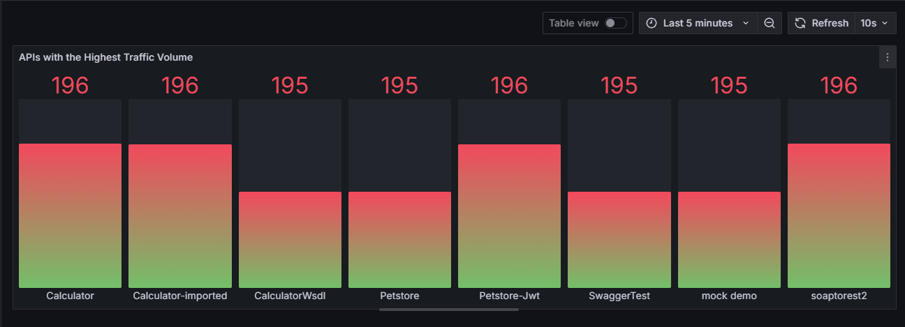
Shows which API Proxies received the most calls in the selected time range. Usage intensity and capacity distribution are read from this panel.
| Field | Visualization | PromQL |
|---|---|---|
| Request increase by API name | Bar gauge or Bar chart | topk(5, sum by (api_name) (increase(apinizer_api_traffic_total_count_tagged_total[100m]))) |
- Visualization can be a horizontal or vertical bar gauge
- Sort from high to low
- Show the
api_namelabel in the legend; this label is the metrics counterpart of the Elasticsearchapn(API Proxy name) field
API processing times
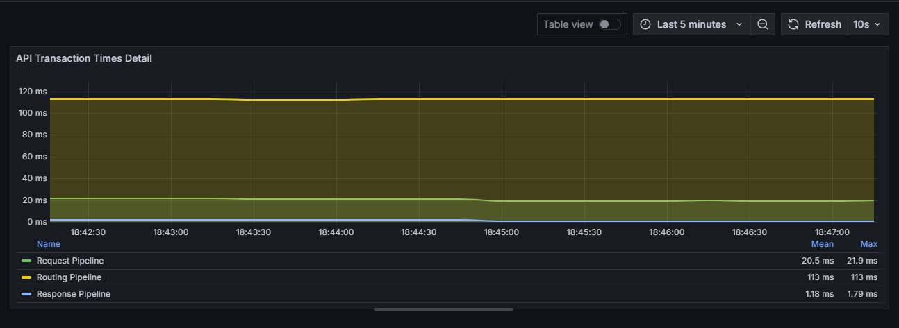
Splits Gateway processing time into three stages: request pipeline, routing, and response pipeline. Values are in milliseconds. This breakdown shows whether latency originates from the policy layer, backend routing, or response handling.
| Series | Visualization | PromQL |
|---|---|---|
| Request pipeline | Timeseries | sum(rate(apinizer_api_traffic_request_pipeline_time_seconds_sum[5m])) / sum(rate(apinizer_api_traffic_request_pipeline_time_seconds_count[5m])) * 1000 |
| Routing | Timeseries | sum(rate(apinizer_api_traffic_routing_time_seconds_sum[5m])) / sum(rate(apinizer_api_traffic_routing_time_seconds_count[5m])) * 1000 |
| Response pipeline | Timeseries | sum(rate(apinizer_api_traffic_response_pipeline_time_seconds_sum[5m])) / sum(rate(apinizer_api_traffic_response_pipeline_time_seconds_count[5m])) * 1000 |
- Y-axis unit:
ms - If routing remains clearly higher than the other series, most of the latency comes from the backend call
Adding panels to a dashboard
Created panels are collected on a single dashboard with Dashboards → New dashboard → Add. A time range of the last 1 hour or last 24 hours and a refresh interval of 30 seconds are recommended.
Request/response size, pod CPU usage, and other panel examples are on the Example Grafana Dashboards page.